Photography and Imagery · Step 1 · 6 min read
Photo, illustration or nothing
A photo says 'this is real', an illustration says 'this is an idea', and nothing says 'the task comes first'. How to choose between them, where generated images fit, and what public design systems decide.
A photo promises that something is real. An illustration promises an idea. Nothing promises that the task comes first. Each one is a choice, and each one says something before anyone reads a word. Choose the promise first; the picture comes after.
What you'll be able to do after reading:
- Choose between a photo, an illustration and no image, with a reason
- Know where AI-generated images fit in that choice
- Explain why a photo of something that doesn't exist yet is a risk
- Learn from how public design systems split photography and illustration
1. What each one promises
| A photo | An illustration | Nothing | |
|---|---|---|---|
| Says | "This exists, and it looks like this" | "Here is an idea, a feeling or a process" | "Your task is the point" |
| Good for | The product, real people, real places, proof | Abstract ideas, processes, things that don't exist yet, sensitive subjects | Forms, data, settings, anything people do every day |
| Risk | Looking generic (stock), or showing something that isn't true | Looking childish or off-brand; explaining less than a diagram | Looking unfinished, if the layout was designed around an image |
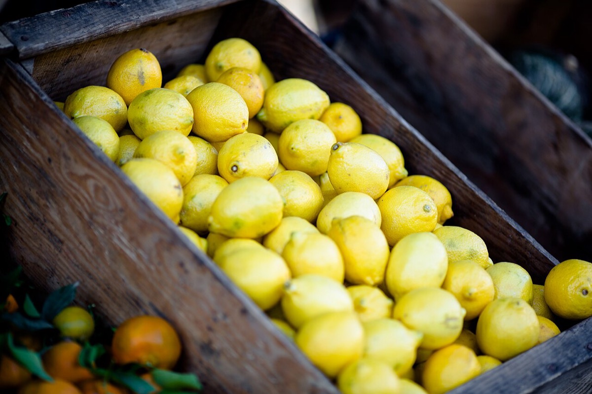 Photo: this is real
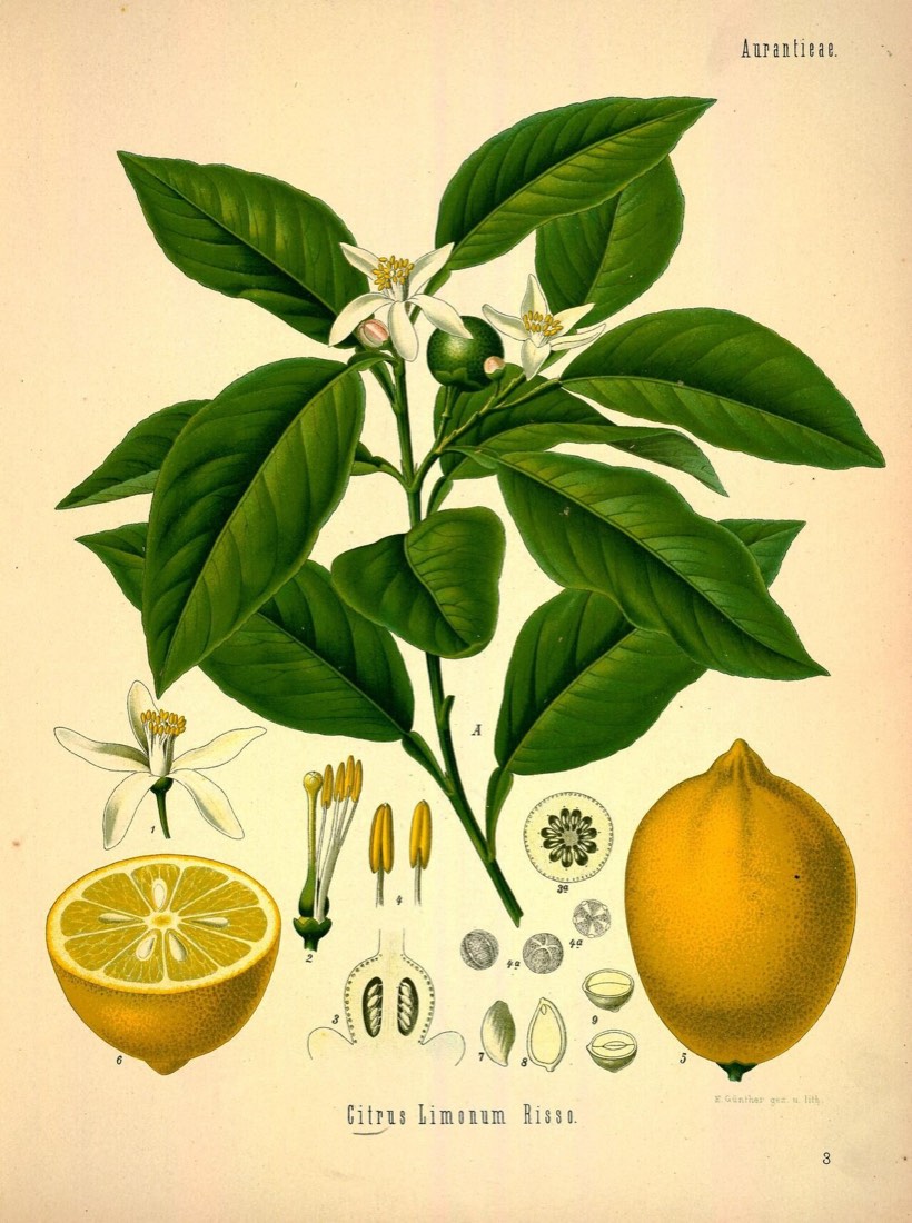 Illustration: here is an idea


Notice the photo's risk: a photo is a promise of reality. If the hotel room in the photo is bigger than the real one, the photo becomes a lie, and people remember lies.
2. Choose a photo when the real thing matters
- People are deciding about something physical: a product, a flat, a dish, a place.
- People need to know who they'll deal with: a doctor, a host, a teacher, the team.
- You need proof: the event happened, the shop exists, the delivery arrived.
In all three, the photo is content. It should be real, specific, and recent enough to still be true.
3. Choose an illustration when the idea matters
- The subject is abstract: "your data is encrypted", "we sync across devices".
- The thing doesn't exist yet, or changes too often to photograph: a new feature, a future building.
- The subject is sensitive, and photos of real people would feel intrusive: health, debt, grief, privacy. An illustration lets people see themselves without seeing a stranger.
- You need consistency at scale: dozens of empty states and onboarding screens in one style.
Molly Bang's Picture This is a short, brilliant book on how simple shapes create feeling: why pointed shapes feel threatening and rounded ones feel safe, and why the same shape means more at the top of a picture than at the bottom. It's a children's-book author explaining composition, and it's one of the best introductions to visual meaning there is.
4. Choose nothing when the task matters
Task screens rarely need images. Forms, tables, settings, dashboards and checkouts work best when nothing competes with the task. The GOV.UK Design System, which designs for millions of people doing serious tasks, asks teams to use images only when users need them (GOV.UK Design System, Images).
"Nothing" is also the cheapest option to ship: no file to load, no licence to track, no alt text to write. Step 7 comes back to this.
5. Where generated images fit
AI image generators add a fourth option that behaves like a photo but promises like an illustration: it looks real, but it isn't. That makes it useful and risky at the same time.
- Useful for mood, concepts, early prototypes and backgrounds, where nobody will take the image as proof.
- Risky anywhere a photo would be a promise of reality: a product, a person, a place, a result. A generated "customer" is a customer who doesn't exist.
Step 4 of this course is about generated images: bias, labels and provenance. If you want to start now, the AI for UX track has AI for visual design: images and video, Generate images locally and Copyright and AI-generated assets.
6. What design systems decide
Public design systems are a good place to see these choices made on purpose:
- IBM Design Language has separate guidelines for photography and for illustration, each with its own point of view and examples. It's one of the most complete public guides to imagery.
- Material Design 2 has imagery, photography and image selection pages. They're marked as no longer maintained, but they're still a clear read.
- GOV.UK takes the opposite stance: few images, only when needed (Images).
- Atlassian documents illustrations for empty states and onboarding, and leaves photography out of the product.
Different products, different answers. What they share is that someone decided, and wrote down why.
7. Common mistakes
- Using a photo for something that doesn't exist yet, so the photo is a mock-up pretending to be real.
- Using illustration for everything because it's "safer", even where people need to see the real thing.
- Using stock photos of people on sensitive subjects.
- Treating "no image" as a gap to fill instead of a choice.
- Using a generated image where a photo would be read as proof.
8. Vocabulary
| Term | Meaning |
|---|---|
| Illustration | A drawn or rendered image that shows an idea rather than a recorded moment |
| Spot illustration | A small illustration that supports one message, often in empty states |
| Empty state | What a screen shows when there's no content yet |
| Generated image | An image made by an AI model from a prompt; it can look like a photo without recording anything |
9. Try it (no tools needed)
- Pick three screens of a product you use: a home or landing screen, a task screen and an empty state.
- For each, decide: photo, illustration or nothing? Write the promise in one sentence ("this is real", "here's how it works", "your task first").
- Compare with what the product actually does. Where do you disagree, and why?
Reflection questions: Have you ever felt misled by a photo in a product? What was the promise it broke?
10. If you already practise
- Add a line to your design system or brand guide: where the product uses photos, where it uses illustration, and where it uses nothing. One table is enough to stop most arguments.
- For sensitive subjects, test illustration and photography with real users before choosing. People in that situation will tell you quickly which one feels respectful.
- Treat generated images like any other source: write down where each one is allowed, and where a real photo is required.
Checklist
Learn more
- GOV.UK Design System: Images
- IBM Design Language: Photography · Illustration
- Material Design 2: Imagery · Photography · Image selection
- Atlassian Design System: Illustrations
Books, courses and videos to go deeper
- Picture This: How Pictures WorkMolly BangBook · Chronicle Books, 25th anniversary edition, 2016 (Amazon)
- Ways of SeeingJohn BergerBook · Penguin, 2008 edition (Amazon)
Book links go to Amazon. As an Amazon Associate I earn from qualifying purchases, at no extra cost to you.
Related
What an image does in a product · The photos nobody looks at · Audit the images in your product · AI for visual design: images and video · Copyright and AI-generated assets · Image role check