Photography and Imagery · Step 2 · 5 min read
Composition
Composition decides where the eye goes first and where it rests. The tools photographers use (the frame, the subject's place, lines, balance and empty space), what the research says about the rule of thirds, and how to leave room for words.
A photo is a set of decisions about what to leave out. The photographer chose the frame, where the subject sits in it and what's left empty. When you pick a photo for a product, you inherit those decisions, and you add one more: where your words go. Learning to see them is the difference between "a nice photo" and "the right photo for this screen".
What you'll be able to do after reading:
- Find the subject of a photo, and say where it sits in the frame
- Use thirds, leading lines, symmetry and balance as reasons, not rules
- Explain what the research says about the rule of thirds
- Spot the empty space where text can go without hiding the subject
1. Start with the subject
Before any rule, ask: what is this photo about? One thing. If you can't name it in two words ("the tree", "the bread", "her hands"), the photo probably doesn't know either, and nobody will look at it for long.
Composition books start here for a reason: every other choice, the frame, the lines, the light, is a way of helping the eye find that one point and stay there. Michael Freeman's The Photographer's Eye is the classic guide to that way of looking (see the books at the end).
2. Four tools, not four rules
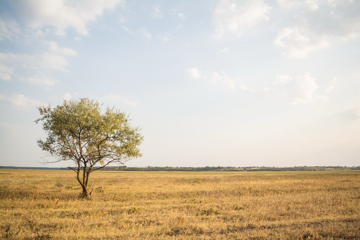 Thirds and negative space
 Leading lines
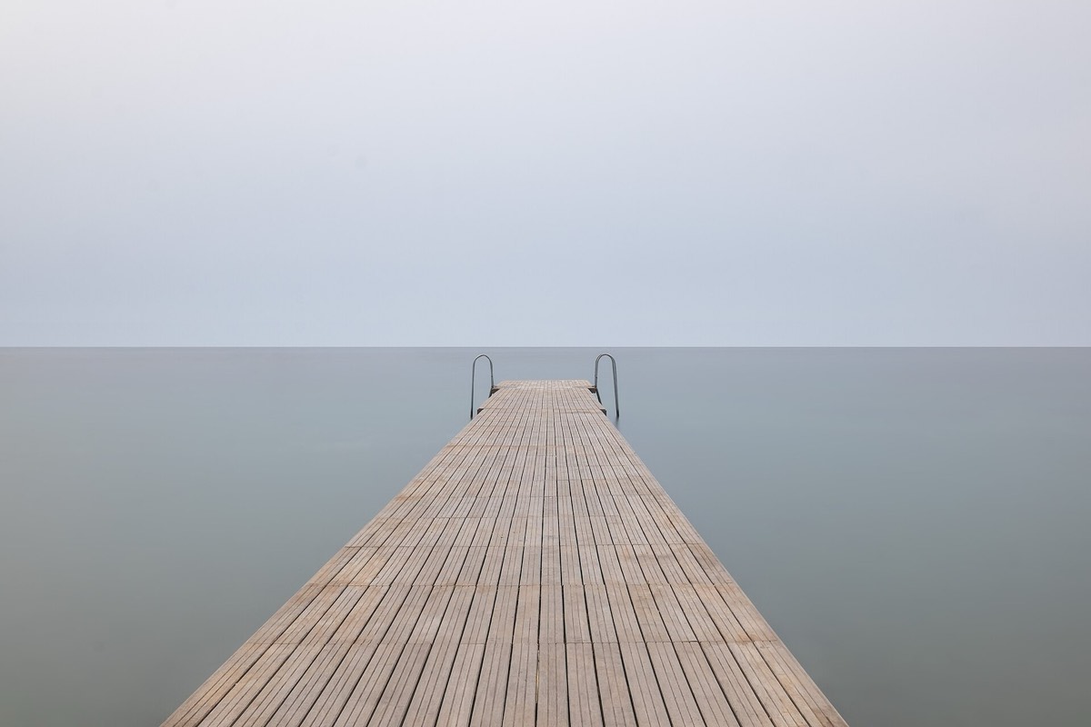 Symmetry


- Thirds. Imagine two lines across and two down, splitting the frame in nine. Putting the subject near one of the lines, or where two cross, leaves the rest of the frame free and often feels calmer than dead centre. The tree in the first photo sits near the left line, and the sky is left empty.
- Leading lines. Roads, rails, rivers, fences, a row of windows: the eye follows lines. When they point at the subject, or meet in the distance, they pull the eye into the photo.
- Symmetry. Centre the subject and split the frame in equal halves. Symmetry feels still, formal, deliberate. The pier walks straight to the horizon.
- Balance. A big dark shape on one side can be balanced by a small bright one on the other. Weight comes from size, contrast and colour, not only from position.
None of these is a law. They're ways to explain why a photo works, and ways to fix one that doesn't.
3. Negative space is room for words
The empty part of a photo, the sky, a wall, a plain table, is called negative space. In print and on screens it has a job: it's where a headline, a button or a caption can go without covering the subject.
This is why photographers working for magazines and brands often shoot "with copy space": the subject on one side, a calm area on the other. When you choose a hero image, look for that area first. If there isn't one, the text will end up on top of the subject, and Step 6 will be about rescuing it.
4. Reading a photo in ten seconds
When someone sends you a photo for a screen, ask these, in order:
- What's the subject? Two words.
- Where is it? Centre, on a third, at an edge.
- What leads to it? Lines, light, someone's gaze (see Faces and gaze).
- What's empty? Is there space for words, and on which side?
- What's distracting? A bright spot at the edge, a sign, a cut-off object.
Five answers, and you can say why the photo works or what to change, in words a stakeholder will follow.
5. Common mistakes
- Choosing a photo with no clear subject because it "has a nice feel".
- Treating the rule of thirds as a test of quality.
- Picking a hero image with no calm area, then fighting to make the text readable.
- Ignoring the edges: a bright object or half a person at the border pulls the eye out of the photo.
6. Vocabulary
| Term | Meaning |
|---|---|
| Subject | The one thing the photo is about |
| Rule of thirds | Placing the subject near lines that split the frame in thirds |
| Leading lines | Lines in the photo that guide the eye towards the subject |
| Negative space | The empty area around the subject; on screens, room for text |
| Copy space | Negative space left on purpose for text |
| Visual weight | How strongly an area pulls the eye, from size, contrast and colour |
7. Try it (no tools needed)
- Open the photo app on your phone and turn on the grid (most cameras have one, often called "grid" or "thirds").
- Take three photos of the same object: once in the centre, once on a third line, once with a line in the room leading to it.
- Imagine a headline on each. Which one has room for it without covering the object?
Reflection questions: Which version would you use on a product page, and which on a campaign? Why?
8. If you already practise
- Add "where does the text go?" to your image brief from the start. It's much cheaper to shoot with copy space than to crop for it later.
- In critiques, use the five questions in section 4. They turn "I don't like it" into something you can fix.
- When the rule of thirds comes up as a rule, quote the 2014 study kindly: it's a useful habit, not a measure of quality.
Checklist
Learn more
- Amirshahi et al., Evaluating the Rule of Thirds in Photographs and Paintings (Art & Perception, 2014)
Books, courses and videos to go deeper
- The Photographer's EyeMichael FreemanBook · remastered 10th anniversary edition (Focal Press, 2017) (Amazon)
- Learning to See CreativelyBryan PetersonBook · 3rd edition (Amphoto, 2015) (Amazon)
- Read This If You Want to Take Great PhotographsHenry CarrollBook · Laurence King, 2014 (Amazon)
Book links go to Amazon. As an Amazon Associate I earn from qualifying purchases, at no extra cost to you.
Related
Light and what it says · Faces and gaze · Crop and aspect ratio · Photo, illustration or nothing · Composition guides