Photography and Imagery · Step 6 · 4 min read
Images in dark mode
A dark theme changes how every image on the page looks: white backgrounds glow, bright photos shout, dark line art disappears. What the guidelines say, what one study found, what's still unknown, and the CSS and HTML to handle each case.
Dark mode changes the page around the photo, and so it changes the photo. The file is the same, but the white background that disappeared on a light page now glows, and the bright sky that felt airy now shouts. Most teams design their dark theme and forget the images in it. Here's what to look for, and the small fixes that work.
What you'll be able to do after reading:
- Spot the three image problems a dark theme creates
- Know what the guidelines say, and where the evidence stops
- Dim, swap or back images in CSS and HTML
- Avoid the theme-switch trap with
<picture>
1. The glowing white box
 Light pageDark page, as isDark page, darkened

Product photos are often shot on white, so they blend into a white page. In a dark theme the same white turns into a bright rectangle. Apple's guidelines say it plainly: if a content image has a white background, consider darkening it slightly so the background doesn't glow in Dark Mode (Apple, Human Interface Guidelines, Dark Mode).
2. Bright photos
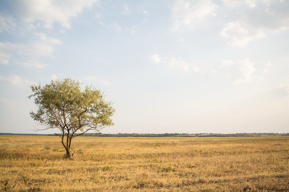 Light pageDark page, as isDark page, darkened

A bright photo on a dark page becomes the brightest thing on the screen. In Thomas Steiner's article on dark mode for web.dev, his own user research found most people preferred slightly less vibrant images in dark mode; he used a CSS filter, grayscale(50%), to tone photos down (Thomas Steiner, prefers-color-scheme: Hello darkness, my old friend, web.dev, 2019).
What we don't know. We looked for peer-reviewed research on photos, or text over photos, in dark themes, and didn't find any. The advice above is from platform guidelines and one practitioner's research. Treat it as a good starting point, and test with your own users and photos.
One thing is clear, though: don't invert photos. The same article cites research by Szpiro and colleagues on how people with low vision use their devices: all the people interviewed disliked inverted images, though many preferred light text on a dark background.
3. The fixes, in code
Dim photos a little, only in the dark theme:
@media (prefers-color-scheme: dark) {
  img:not([src$=".svg"]) { filter: brightness(.85) contrast(1.05); }
}
Swap an image when a dark version exists, like a screenshot of your own UI or a diagram (MDN, picture):
<picture>
  <source srcset="dashboard-dark.png" media="(prefers-color-scheme: dark)">
  <img src="dashboard-light.png" alt="The dashboard, showing this week's orders.">
</picture>
Give dark line art a backing. A logo or drawing with dark strokes on a transparent background vanishes on a dark page. Give it a light card, or draw it in SVG with currentColor so it takes the text colour.
4. The theme-switch trap
prefers-color-scheme follows the system or browser setting (MDN, prefers-color-scheme). If your site also has its own light and dark switch, a <picture> with that media query ignores it: someone who chose dark on your site, on a light system, gets the light image. Test the combinations, and, if you have a switch, apply the image rules with the same class the switch sets, not only with the media query.
5. Common mistakes
- Product photos on white, unchanged, in a dark theme.
- Inverting photos to "make them dark".
- Light screenshots of your own UI inside the dark theme.
- Dark logos on transparent backgrounds that disappear.
- Testing the dark theme with the OS setting, but not with the site's own switch.
6. Vocabulary
| Term | Meaning |
|---|---|
| Dark theme / dark mode | A colour scheme with light content on dark backgrounds |
| prefers-color-scheme | The CSS media feature that reports the system or browser's light or dark setting |
| Glow | A light area that looks brighter than everything around it on a dark page |
| Inversion | Swapping every colour for its opposite: fine for some interfaces, wrong for photos |
7. Try it (no tools needed)
- Switch your phone to dark mode and open three apps or sites you use.
- Look only at the images: product photos, heroes, logos, screenshots.
- Note which ones glow, which disappear and which look right.
Reflection questions: Did the images that looked right do something different from the others? Which fix from section 3 would help the worst one?
8. If you already practise
- Review every image type in your product in both themes: product, hero, illustration, logo, screenshot.
- Add a dark-theme row to your image style guide: dim or not, which images get a dark version.
- Test with the system setting and with your site's own switch, in both directions.
Checklist
Learn more
- Apple Human Interface Guidelines, Dark Mode
- Thomas Steiner, prefers-color-scheme: Hello darkness, my old friend (web.dev, 2019)
- MDN: prefers-color-scheme · picture
Related
Measuring contrast on a photo · Scrims, safe areas and focal points · Grade, black and white and duotone · One look for the whole product