Photography and Imagery · Step 7 · 4 min read
Responsive images and art direction
One photo, many screens: how srcset and sizes let the browser download the right file, and how picture lets you change the crop for small screens. What designers need to specify so developers can build it.
A phone shouldn't download a photo made for a cinema screen. The same image appears at 360 pixels on a phone and 1400 on a desktop, and on high-density screens it needs more pixels still. HTML can offer the browser several files and let it choose, and it can swap the crop when the screen changes shape. Developers write the code; designers decide what it should do.
What you'll be able to do after reading:
- Explain what
srcsetandsizesdo, in plain words - Tell resolution switching from art direction
- Use
<picture>to change the crop on small screens - Specify responsive images in a handoff
1. Three files, one photo
 480 px wide: 33 KB
 960 px wide: 115 KB
 1600 px wide: 285 KB
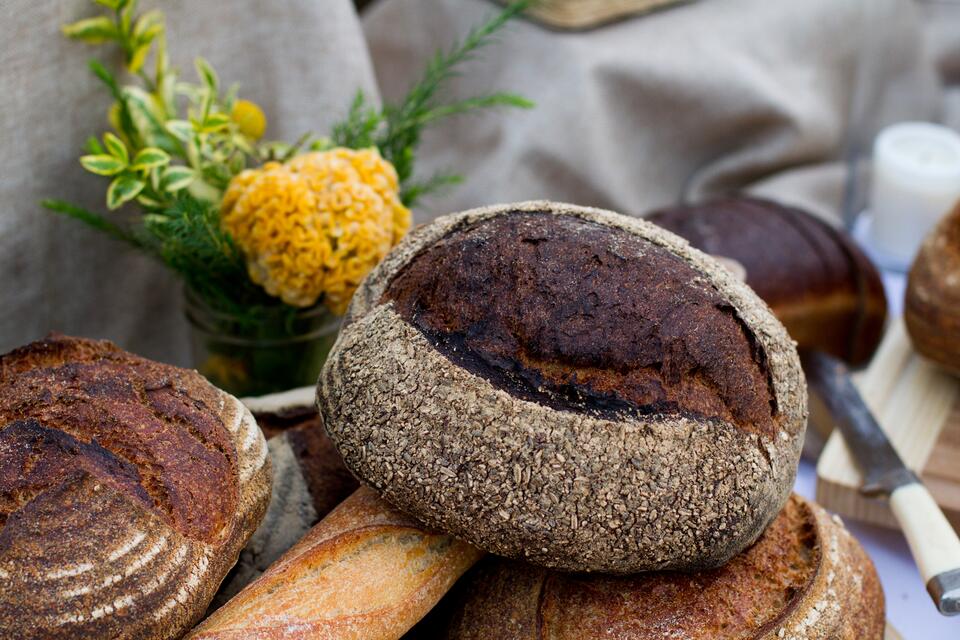
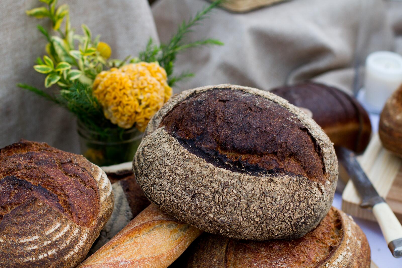
srcset and sizes the browser picks, and a phone downloads about a ninth of the bytes.Files made for this course from the original photo, at 5184 by 3456 pixels: Kim Cruickshanks, Wikimedia Commons (from Unsplash), CC0.
These three files look the same here, and the biggest weighs almost nine times the smallest. Responsive images are how you send each screen the one it needs.
2. srcset and sizes: let the browser choose
<img src="bread-960.jpg"
     srcset="bread-480.jpg 480w, bread-960.jpg 960w, bread-1600.jpg 1600w"
     sizes="(max-width: 560px) 100vw, 40rem"
     width="1600" height="1067" alt="A round seeded sourdough loaf among other breads.">
srcsetlists the files and their widths.sizestells the browser how wide the image will be on screen: here, the full width on phones and 40rem otherwise.- The browser does the maths, including the screen's pixel density, and downloads the smallest file that still looks sharp (MDN, Using responsive images in HTML). That's what the Hairline figure at the start of this step shows.
This is called resolution switching: same picture, different sizes. The img element and these attributes have worked in every major browser for years (MDN, img).
3. <picture>: change the crop

<picture>. On a wide screen you get the wide crop, with the whole table of breads. Make the window narrower than 560 pixels, or open the page on a phone, and the browser swaps in a tall crop made around the seeded loaf. That's art direction: not a smaller file, a different crop.Files made for this course from the original photo, at 5184 by 3456 pixels: Kim Cruickshanks, Wikimedia Commons (from Unsplash), CC0.Sometimes a smaller file isn't enough: the wide photo, shrunk to a phone, turns the loaf into a crumb. Art direction means giving small screens a different crop, made for them (MDN, picture):
<picture>
  <source media="(max-width: 560px)" srcset="bread-tall.jpg">
  <img src="bread-wide.jpg" width="1200" height="515" alt="Breads and flowers on a table.">
</picture>
The img inside is required, and it's the one that carries the alt text. <source> can also offer formats, like AVIF or WebP first and JPEG as the fallback.
Use art direction when the subject would get lost or cut. For everything else, one crop with a focal point (see Scrims, safe areas and focal points) is simpler.
4. What designers specify
Developers can't guess these, so put them in the handoff:
- How wide the image is at each breakpoint: the
sizes. - The crops, if art direction is needed, and the breakpoint where they swap.
- The focal point, for single crops that scale.
- The quality bar and format (see Formats and compression).
- The alt text, written by someone who knows why the image is there (see Alt text that helps).
5. Common mistakes
- One huge file for every screen.
- A
sizesthat doesn't match the layout, so the browser picks the wrong file. - Art direction for every image, when a focal point would do.
- Text baked into the image, which shrinks to nothing on phones.
- Leaving out the
imginside<picture>.
6. Vocabulary
| Term | Meaning |
|---|---|
| Resolution switching | Offering the same picture at several sizes |
| Art direction | Offering a different crop for different screens |
| srcset | The list of files the browser can choose from |
| sizes | How wide the image will be on screen, so the browser can choose |
| Pixel density | How many device pixels a screen packs into each CSS pixel |
7. Try it (no tools needed)
- Pick a hero image in your product.
- Sketch how it should look on a phone, a tablet and a desktop.
- Decide: is a smaller file enough, or does the phone need a different crop?
Reflection questions: What gets lost when the desktop crop shrinks to a phone? Would a focal point save it, or does it need its own crop?
8. If you already practise
- Add image widths per breakpoint to your component specs, so
sizescomes from the design. - Agree the standard widths (for example 480, 960, 1600) with the team and generate them automatically.
- Review art-directed crops on real phones, not just a narrow desktop window.
Checklist
Learn more
- MDN: Using responsive images in HTML · img · picture
- web.dev, Learn Images
Books, courses and videos to go deeper
Book links go to Amazon. As an Amazon Associate I earn from qualifying purchases, at no extra cost to you.
Related
Formats and compression · Crop and aspect ratio · Scrims, safe areas and focal points · Images and page speed · Responsive image checklist