Photography and Imagery · Step 6 · 5 min read
Measuring contrast on a photo
Text on a photo has no single background colour, so it has no single contrast number. What WCAG asks for text over images, how to find the spot that decides, and why a component has to pass on its worst photo, not on the one in the mockup.
On a photo, contrast isn't one number. It's the worst number behind your words. On a flat background you check two colours and you're done. On a photo the background changes under every letter, and readability is decided by the one spot that's most like the text. Find that spot, and you've measured. Miss it, and the headline that passed in the mockup fails on the next photo.
What you'll be able to do after reading:
- Explain what WCAG asks for text over images, in plain words
- Find the spot on a photo that decides the contrast
- Measure it with free tools, by hand
- Judge a text-over-image component on its worst photo
1. Same photo, three answers
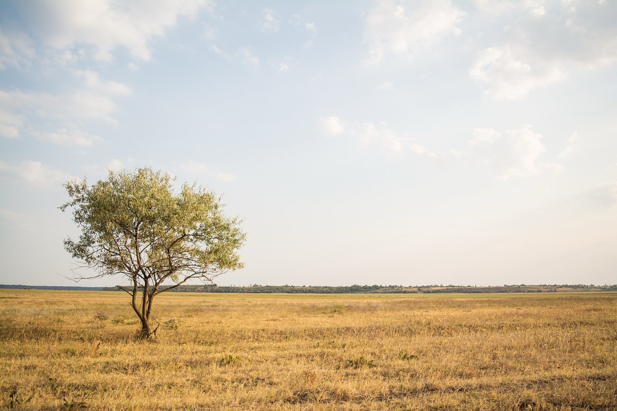 White on the sky: 1.2 to 1Dark on the sky: 8.5 to 1White on the grass: 1.7 to 1

The words, the size and the photo are the same. Only the place and the colour change, and the result goes from unreadable to fine. That's the first thing to learn about text on images: the photo doesn't have a contrast, the place under the text does.
2. What WCAG asks
- Text needs a contrast of at least 4.5 to 1 with its background; large text, at least 18 point, or 14 point bold, needs 3 to 1 (W3C, Understanding 1.4.3).
- Icons and controls on a photo, like a play button or a close icon, need 3 to 1 against what's around them (W3C, Understanding 1.4.11).
- On a photo, measure against the parts most like the text. W3C lists background images without enough contrast as a known failure, and says the contrast has to hold "between the text and those parts of the image that are most like the text and behind the text" (W3C, failure F83). For white text, that's the lightest part behind it; for dark text, the darkest.
Two things don't count. Text that happens to be in a photo, like a street sign, has no requirement. Text baked into an image to look nice does: it has to pass like any other text, and it's better as real text (W3C, Understanding 1.4.5).
3. How to measure, by hand
- Look behind the text for the spot most like it: the brightest cloud behind white letters, the darkest shadow behind black ones.
- Pick that pixel's colour with an eyedropper: in Figma, in the browser's developer tools, or in any image editor.
- Check the pair in a contrast checker, such as WebAIM's.
- Do it again at every size. When the layout crops the photo differently (see Crop and aspect ratio), a different spot ends up behind the text.
The numbers in this step's figures were measured the same way, automatically: hide the text, take a picture of the figure, find the lightest pixel behind where the words sit, and compare it with white. It's the hand method with a script doing the looking.
4. The worst photo decides
Grassland: 1.7 to 1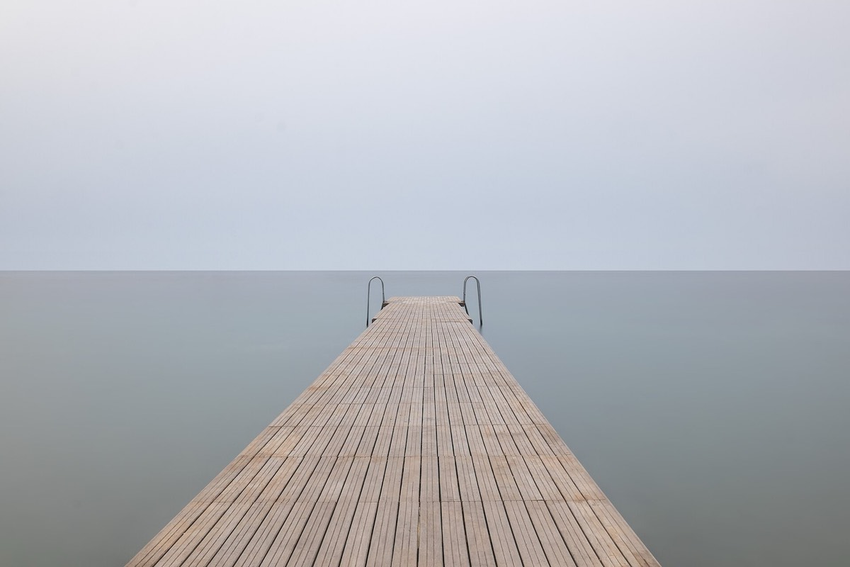 Pier: 2.0 to 1
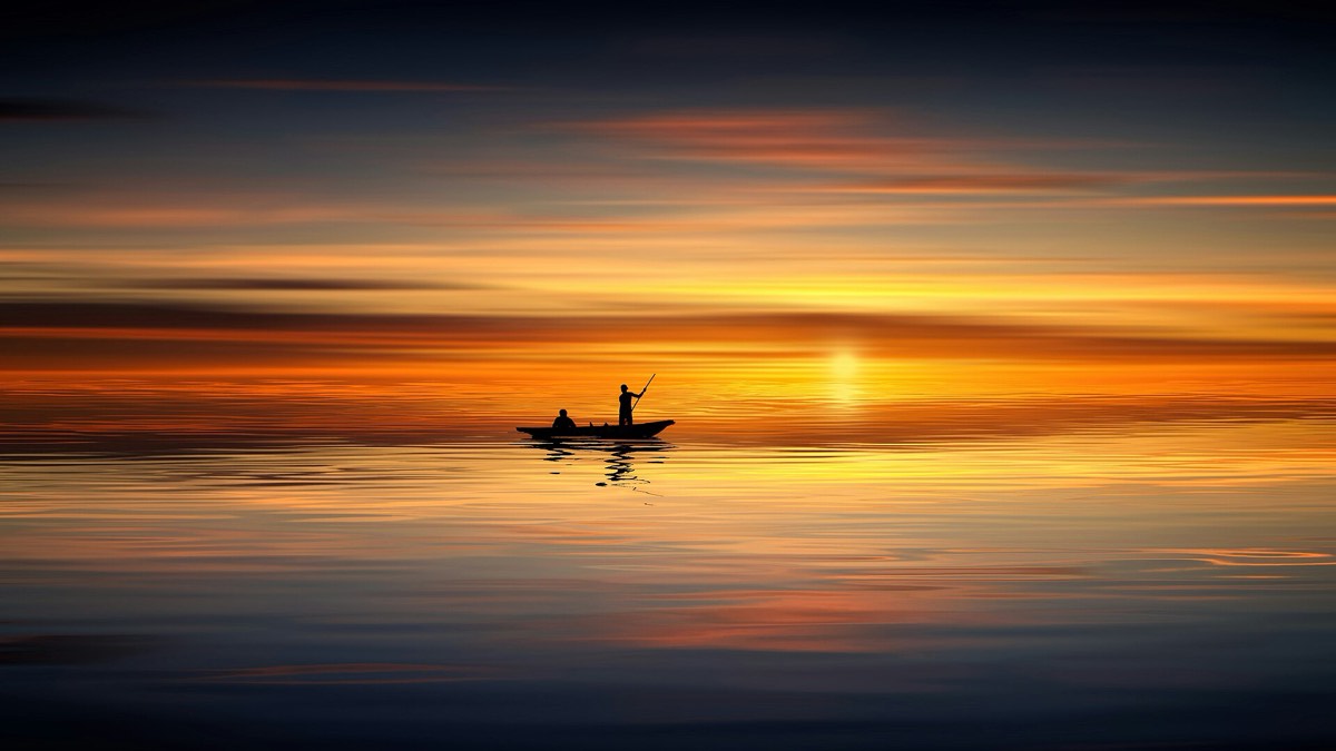 Sunset: 3.6 to 1


A hero, a card or a banner with text on a photo is a component, and it will carry many photos you haven't seen yet. NN/g's advice is the right rule: consider all the images the design may use, and make sure the technique gives enough contrast for the worst-case image and text placement (NN/g, Ensure High Contrast for Text Over Images, 2015).
In practice: test the component with the lightest, busiest and most colourful real photos you have, not the calm one from the mockup. The next lesson is how to make it pass on all of them.
5. Common mistakes
- Measuring the average colour of the photo instead of the worst spot.
- Checking the mockup photo only.
- Checking on desktop only, where the crop puts calmer sky behind the text.
- White text over a light image with a text shadow as the only help.
- Baking headlines into banner images, where they can't be checked, translated or resized.
6. Vocabulary
| Term | Meaning |
|---|---|
| Contrast ratio | How different two colours are in lightness, from 1:1 (the same) to 21:1 (black on white) |
| Large text | At least 18 point (about 24 px), or 14 point (about 18.7 px) bold |
| Non-text contrast | The 3:1 rule for icons, controls and meaningful graphics |
| Image of text | Text saved as pixels in an image, instead of real text |
| Worst case | The photo and placement that give the lowest contrast |
7. Try it (no tools needed, or one free checker)
- Find a hero with text on a photo, on any site.
- Point at the spot behind the text that's most like the text colour.
- If you can, pick that colour and check it in a contrast checker. If not, squint: what disappears first?
Reflection questions: Would the same headline still pass on the site's other photos? Who on the team would notice if it didn't?
8. If you already practise
- Keep a "worst photos" set for each text-over-image component and use it in every review.
- Add the contrast check to the component's definition of done, at the smallest and largest crop.
- Keep headlines as real text, never baked into the image.
Checklist
Learn more
- W3C: Understanding 1.4.3, Contrast (minimum) · Understanding 1.4.11, Non-text contrast · Failure F83
- Aurora Harley, Ensure High Contrast for Text Over Images (NN/g, 2015)
- WebAIM contrast checker
Related
Masks, clip paths and scrims · Scrims, safe areas and focal points · Crop and aspect ratio · Composition · Text-over-image contrast check