Photography and Imagery · For leads · 4 min read
An image style guide in your design system
For leads: how to turn this course into rules your team can use. What an image style guide contains, why it belongs in the design system next to colour and type, how to write rules people follow, and how to keep it alive.
If the image rules live in one person's head, the product has as many looks as it has designers. Colour, type and spacing made it into design systems years ago. Images rarely did, so every team picks, crops and treats photos its own way. An image style guide is how a lead turns taste into something a new designer can follow on day one, and a reviewer can check.
What you'll be able to do after reading:
- List what an image style guide should contain
- Write rules as values and examples, not adjectives
- Put image rules into the design system as components and tokens
- Keep the guide alive as the product changes
1. Show, don't describe
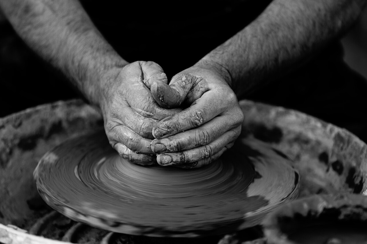 Do: real hands, real work
 Don't: the generic desk
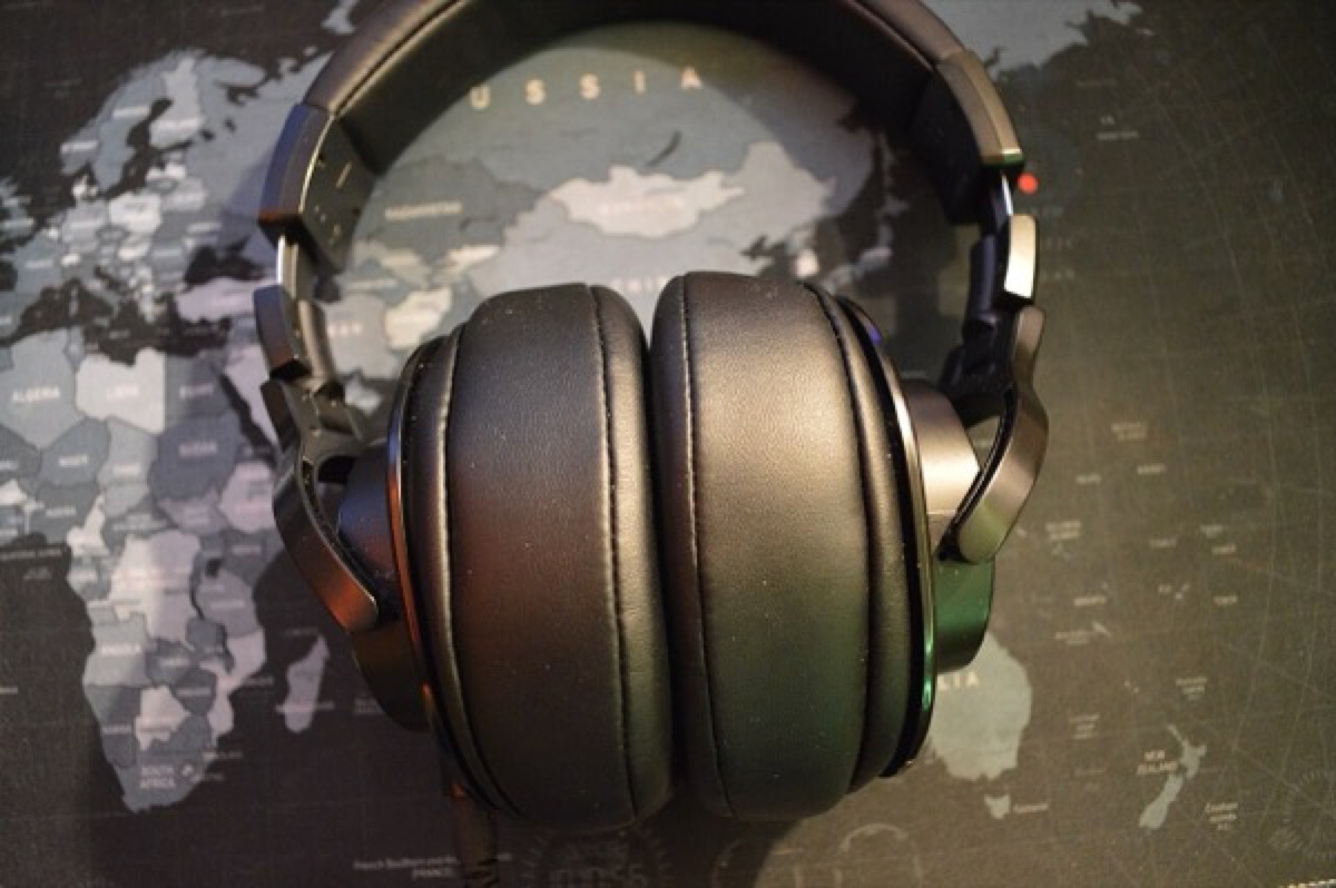 Do: the product, clearly
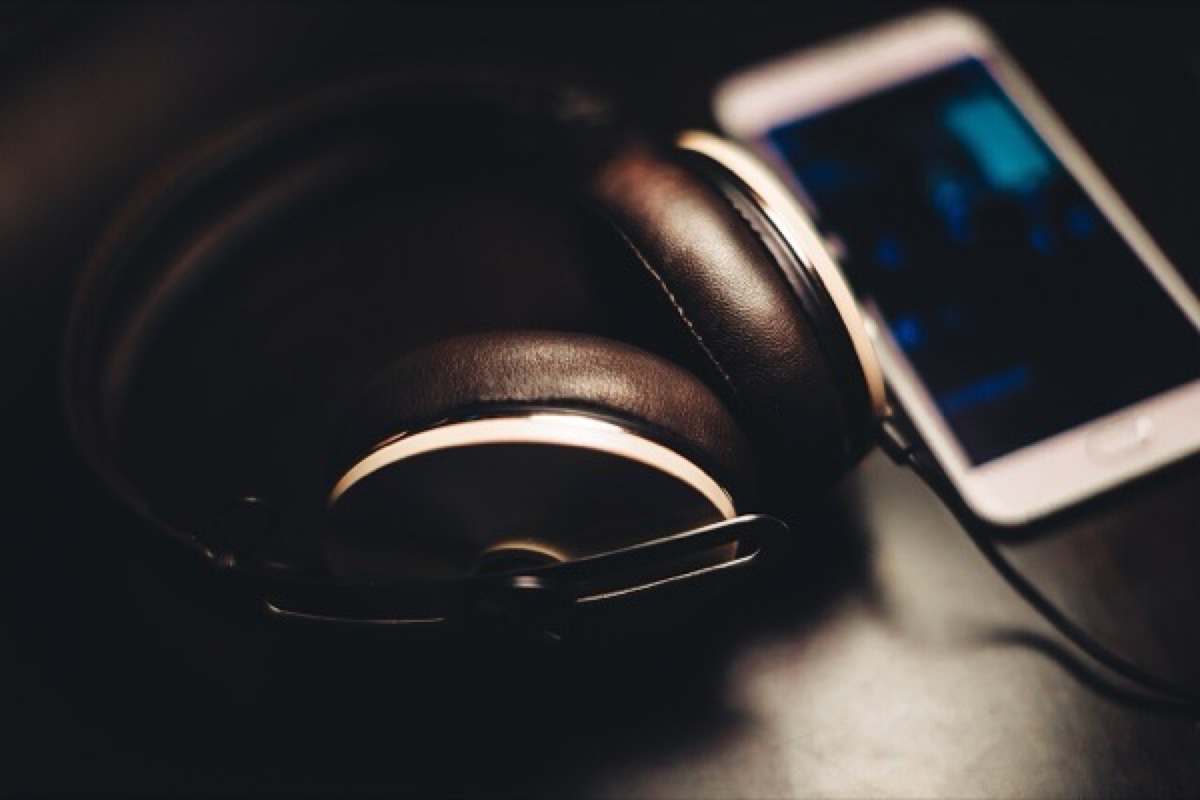 Don't: mood that hides it
The best public image guides are mostly pictures. IBM's photography guidance, Material's imagery pages and the GOV.UK Design System's images page all pair rules with examples (IBM Design Language, Photography, Material Design 2, Imagery, GOV.UK Design System, Images). A "do" and a "don't" side by side settles more arguments than a paragraph.
2. What goes in it
One page per topic, each with values and examples, drawn from this course:
| Section | What it says | From |
|---|---|---|
| Jobs | Which jobs images do in the product, and where none is better | What an image does in a product |
| Sources | Library, shoot or generated, and the allowed libraries and licences | Library, shoot or generated · Licences without fear |
| Subjects and people | Who appears, how, with which releases | People in images |
| Light and composition | The light, the distance, space for text | Light and what it says · Composition |
| Treatment | The grade, grain and masks, as values | Grade, black and white and duotone · Treatment with a purpose |
| Text over images | Safe areas, scrims, contrast minimums | Scrims, safe areas and focal points |
| Crops | Ratios per component, focal points | Crop and aspect ratio |
| Generated images | When allowed, how labelled | A team policy for generated images |
| Delivery | Formats, quality, sizes, a weight budget | Formats and compression |
| Alt text | Who writes it, and how | Alt text that helps |
3. Rules people follow
- Values, not adjectives. "Warm and natural" means something different to everyone; "sepia 35%, saturation 90%" doesn't.
- Examples for every rule, with a do and a don't.
- A reason for every rule, in one line. People follow rules they understand, and break the others.
- A weight budget. Lara Hogan's Designing for Performance makes the case that page speed is part of design, not only engineering. A limit on image weight per page is a practical way to act on it, since images are usually most of a page's weight (see Images and page speed).
4. Build it into the system
A guide people have to remember is weaker than a component that does it for them:
- Image components with the crop ratios,
object-fitand focal point built in. - Tokens for the grade, the grain and the scrim strength, used by those components.
- A text-over-image component that ships with its safe area and scrim, tested on worst photos.
- Fields in the library for alt text, source, licence and focal point (see Running an image library).
5. Keep it alive
- An owner, by name, who reviews new image types.
- A review rhythm: every few months, look at the product's images together, against the guide.
- A changelog, so people know what changed and why.
- Real examples from your product, replacing generic ones as soon as you have them.
6. Common mistakes
- A mood board instead of a guide: inspiring, and impossible to check.
- Rules with no examples, or examples with no rules.
- A guide that lives in a slide deck nobody opens.
- Treatment values in the guide that differ from the ones in code.
7. Try it (no tools needed)
- Pick three images from your product that look like they belong to different products.
- Write the one rule that would have made them match.
- Write it as a value, with a do and a don't.
Reflection questions: Who on your team would be the owner of the guide? What's the first rule you'd turn into a component?
Checklist
Learn more
Books, courses and videos to go deeper
Book links go to Amazon. As an Amazon Associate I earn from qualifying purchases, at no extra cost to you.
Related
One look for the whole product · Running an image library · A team policy for generated images · What a design system is