Photography and Imagery · Step 2 · 5 min read
Light and what it says
Light decides the mood of a photo before anyone notices the subject. Hard and soft light, direction, backlight and low key, warm and cool, and how to choose light that matches what a screen has to say.
Photography is writing with light, and light has a tone of voice. The same café looks calm under soft window light and dramatic under a hard midday sun. People feel that difference before they notice what's in the photo. If the light says "loud" and your screen says "relax", the photo is working against you.
What you'll be able to do after reading:
- Tell hard light from soft light, and know what makes each one
- Read the direction of light and what it does to a subject
- Recognise backlight, low key and high key, and the feeling of each
- Choose light that matches the job and the mood of a screen
1. Hard and soft
The most useful thing to know about light fits in one sentence: the bigger the light source compared with the subject, the softer the light.
- Hard light comes from a small source, or a far one: the sun on a clear day, a bare bulb. Shadows are sharp and dark. It feels graphic, energetic, sometimes harsh.
- Soft light comes from a large source, close to the subject: a window, an overcast sky, a light bounced off a wall. Shadows are soft and gradual. It feels calm, close, flattering.
The sun is huge, but it's so far away that it acts as a tiny point: that's why a clear day gives hard light. On a cloudy day the whole sky becomes the source, and the light goes soft. Light: Science & Magic, the standard textbook on lighting, builds its whole method on this idea of the source's size and distance (see the books at the end).
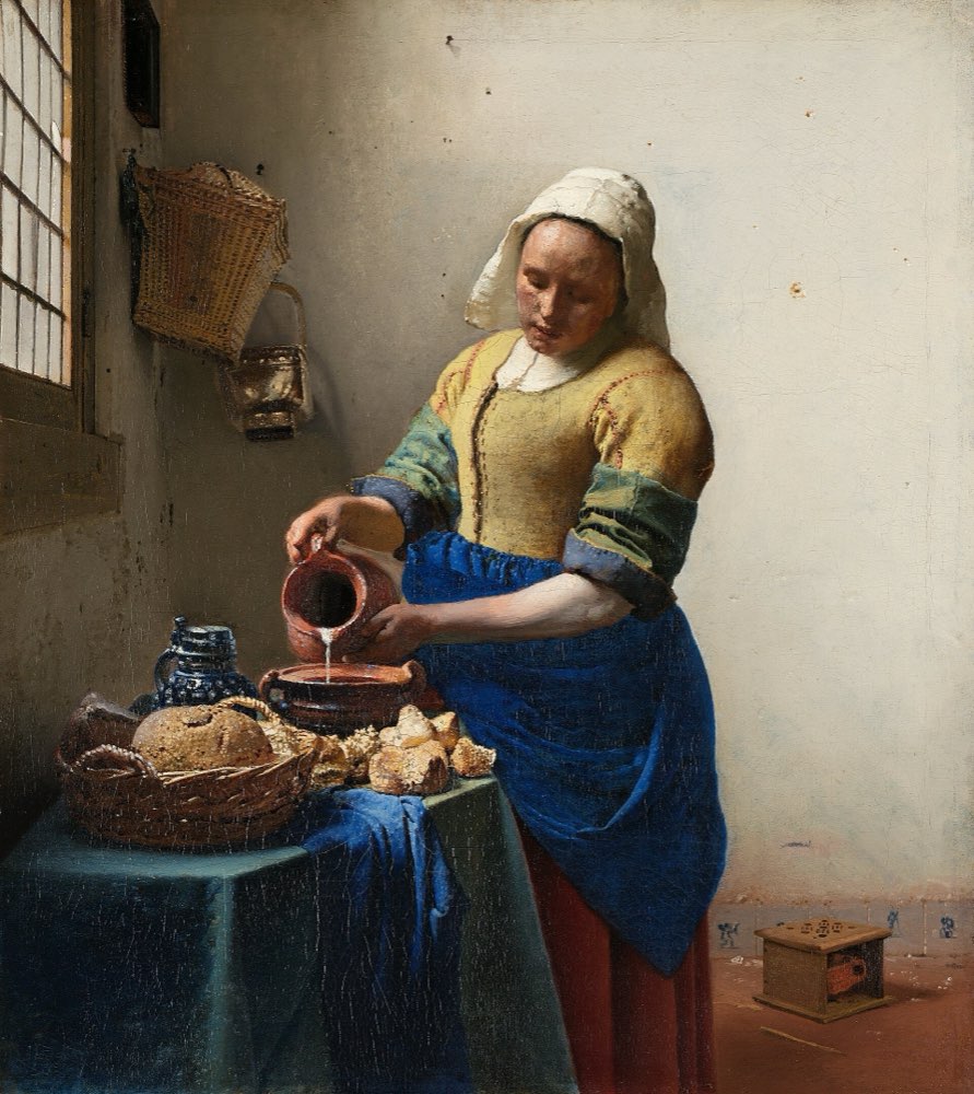 Soft: window light
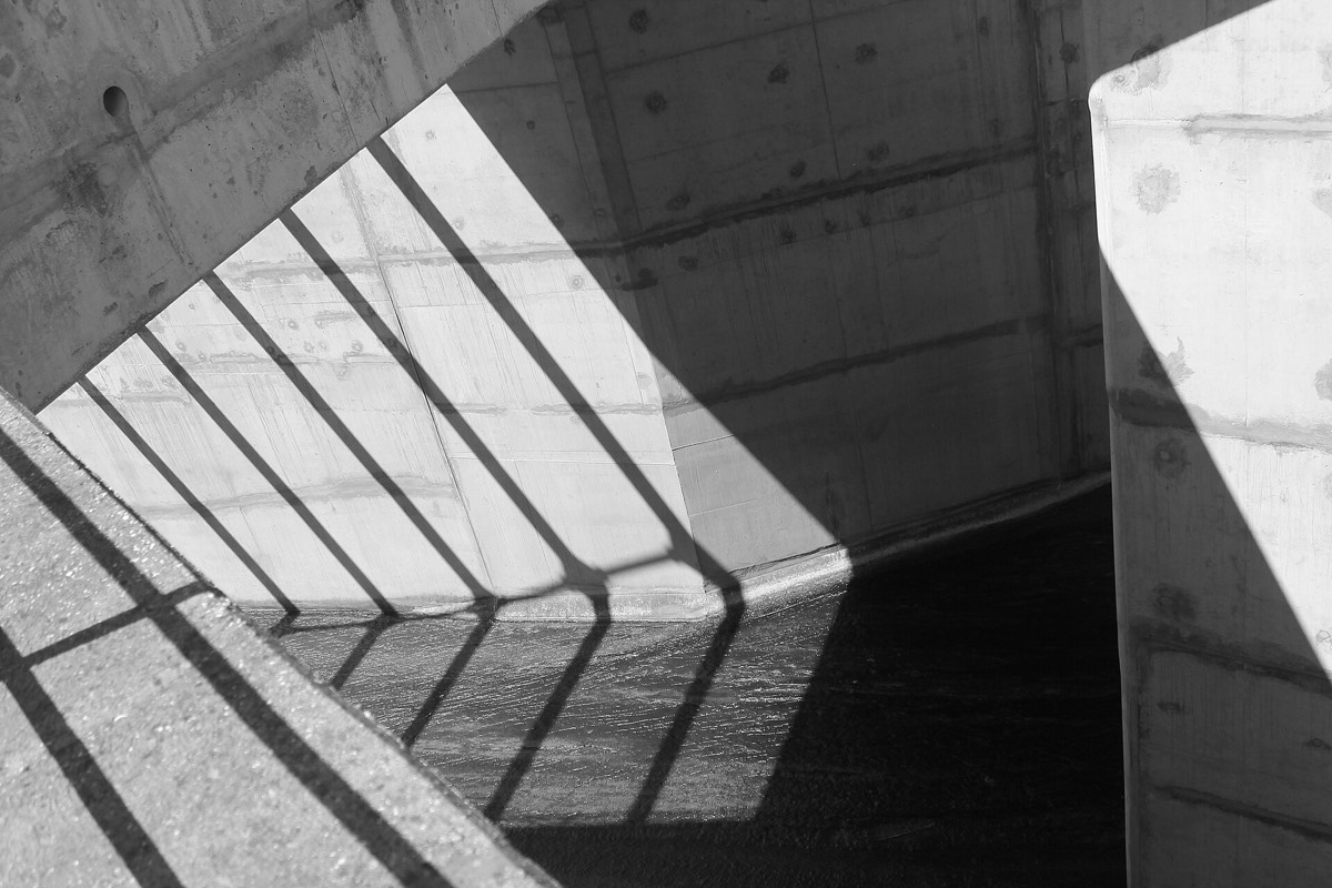 Hard: direct sun
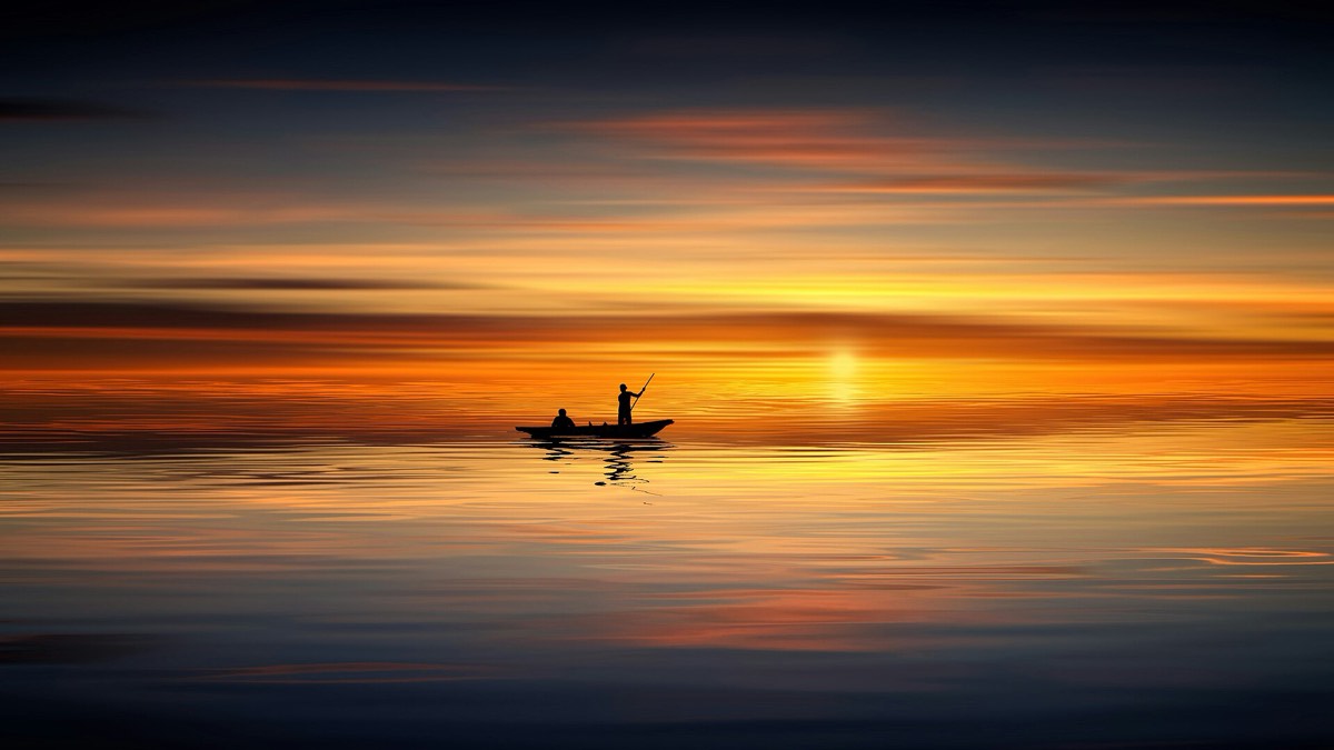 Backlight: silhouette
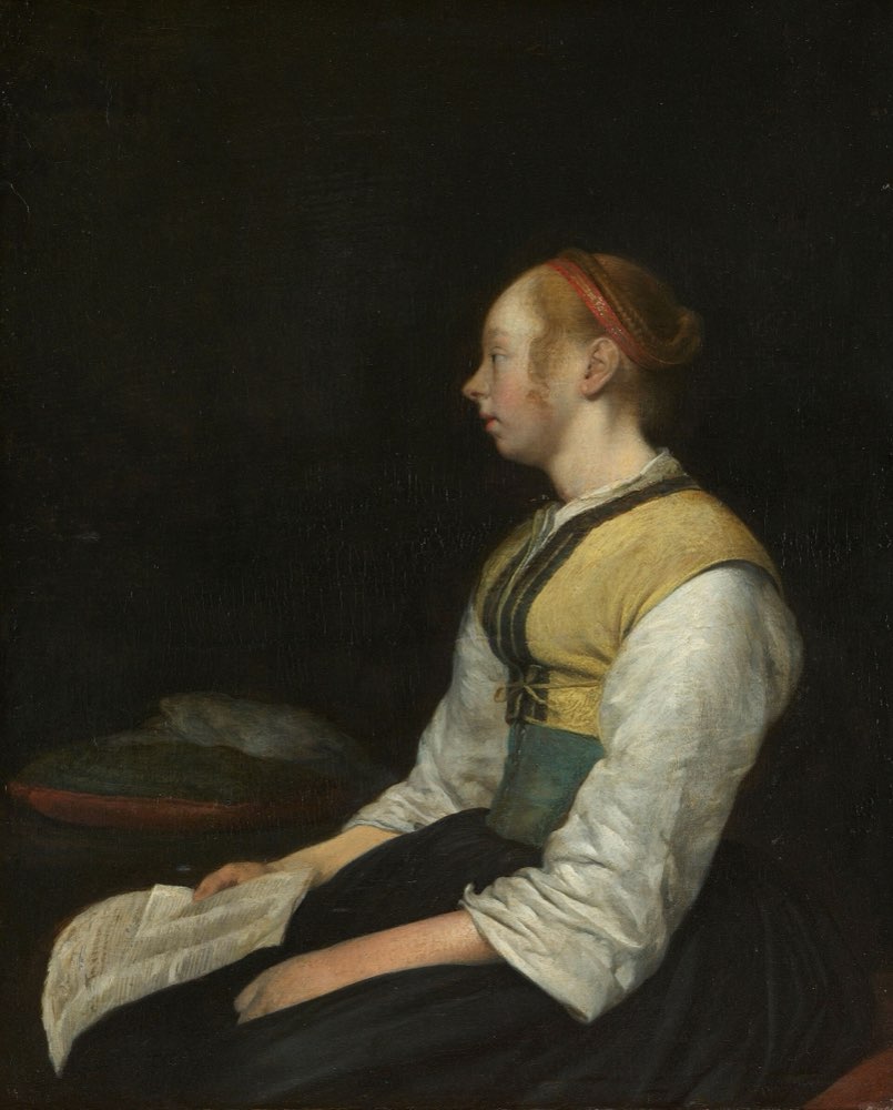 Low key: light from the dark


2. Direction
Where the light comes from changes what you see:
- Front light (from behind the camera) shows everything evenly, but flattens shape and texture.
- Side light shows shape and texture: the folds of a cloth, the weave of bread, the grain of wood. Vermeer's Milkmaid is lit from a window on the left; you can almost feel the crust of the bread.
- Backlight (from behind the subject) separates it from the background. Turned up, it makes a silhouette: a shape with no detail, all outline.
- Top light at midday makes deep shadows under eyes and objects. It's the light most people avoid, unless they want it to look hot and harsh.
3. Low key, high key
- Low key: mostly dark, with light only on what matters. Gerard ter Borch's seated woman, in the figure above, is lit on her sleeve and the paper in her lap; everything else falls into shadow. It feels serious, intimate, premium.
- High key: mostly light, few shadows. Think of product shots on white, or bright, airy lifestyle photos. It feels clean, open, easy.
Neither is better. They say different things, and a product usually needs one tone more than the other.
4. Warm and cool
Light has colour too. The low sun early or late in the day is warm (orange, gold); shade and overcast skies are cool (blue). Indoor bulbs are often warm; screens and some office lights are cool.
Two practical consequences:
- Mood: warm light reads as cosy, nostalgic, human; cool light as calm, clinical, technical.
- Consistency: a set of photos with mixed colour temperatures looks like it came from different products. Step 3 comes back to this when you choose and direct images, and Step 5 when you treat them.
5. Matching light to the job
| The screen's job | Light that usually helps |
|---|---|
| Show the thing clearly (a product page) | Soft, even, true colour; shadows that show shape but hide nothing |
| Show how (a step, a detail) | Soft side light that shows texture and edges |
| Show who (real people) | Soft window light, people facing it |
| Set a calm mood | Soft, warm or neutral, high key |
| Set a bold mood | Hard light, strong shadows, or low key |
When a photo's light fights the screen's tone, people feel the mismatch even if they can't name it.
6. Common mistakes
- Using hard, dramatic light on a product page, where people need to see the thing.
- Mixing warm and cool photos on one screen.
- Choosing a backlit sky for a hero, then putting white text on its brightest part.
- Calling every dark photo "moody". Low key works when the light lands on the subject; otherwise it's just dark.
7. Vocabulary
| Term | Meaning |
|---|---|
| Hard light | Light from a small or distant source; sharp, dark shadows |
| Soft light | Light from a large, close source; gradual shadows |
| Backlight | Light from behind the subject |
| Silhouette | A subject shown only as a dark outline against a bright background |
| Low key / high key | A mostly dark / mostly light picture |
| Colour temperature | How warm (orange) or cool (blue) light looks |
| Golden hour | The time after sunrise and before sunset, when the sun is low and warm |
8. Try it (no tools needed)
- Put a cup on a table near a window. Take one photo with the window to the side, one with the window behind the cup, and one with a lamp above it.
- Now hang a thin white sheet or paper over the window and take the side photo again.
- Compare the shadows. Which version would you use to sell the cup, and which for a cosy campaign?
Reflection questions: What does the light in your product's main image say? Is it the same thing your copy says?
9. If you already practise
- Add light to your image brief: "soft window light from the left, warm, high key" is a sentence a photographer can work with. "Make it nice" isn't.
- When you build an image set, check light direction and colour across all photos side by side, not one by one.
- If you can't control the shoot, choose stock photos for their light first and their subject second. Light is harder to fix later than a crop.
Checklist
Learn more
- Rijksmuseum: Johannes Vermeer, The Milkmaid, about 1660
Books, courses and videos to go deeper
- Light: Science & MagicFil Hunter, Steven Biver, Paul Fuqua and Robin ReidBook · 6th edition (Routledge, 2021) (Amazon)
- Color and Light: A Guide for the Realist PainterJames GurneyBook · Andrews McMeel, 2010 (Amazon)
- Understanding ExposureBryan PetersonBook · 4th edition (Amphoto, 2016) (Amazon)
Book links go to Amazon. As an Amazon Associate I earn from qualifying purchases, at no extra cost to you.
Related
Composition · Faces and gaze · Crop and aspect ratio · What an image does in a product