Photography and Imagery · Step 2 · 5 min read
Crop and aspect ratio
The same photo has to work as a wide banner, a tall phone screen and a square card. How aspect ratios change a photo, why cropping from the centre loses subjects, and how a focal point keeps them, in Figma and in CSS.
A photo in a product is never shown just once. It's a banner on a laptop, a tall card on a phone, a square in a share preview and a thumbnail in a list. Each one is a new crop, and every crop is a new composition. If nobody decides where the crop goes, the code will put it in the centre, and the centre is rarely where the subject is.
What you'll be able to do after reading:
- Name the common aspect ratios and where each one appears
- Explain why centre crops lose subjects
- Set a focal point so every crop keeps the subject
- Brief a photo so it survives the crops it will meet
1. Ratios you will meet
| Ratio | Shape | Where it shows up |
|---|---|---|
| 16:9 | Wide | Banners, video, laptop heroes |
| 3:2 | Landscape | Most cameras; articles and cards |
| 4:3 | Squarer landscape | Phone cameras, tablets |
| 1:1 | Square | Avatars, thumbnails, grids |
| 4:5 | Slightly tall | Phone feeds, mobile cards |
| 9:16 | Tall | Full-screen phone stories and heroes |
A photo shot at 3:2 and shown at 9:16, at the same height, keeps only 37.5% of its width: it loses nearly two thirds. That's not a small adjustment; it's a different photo.
2. The centre is not a plan
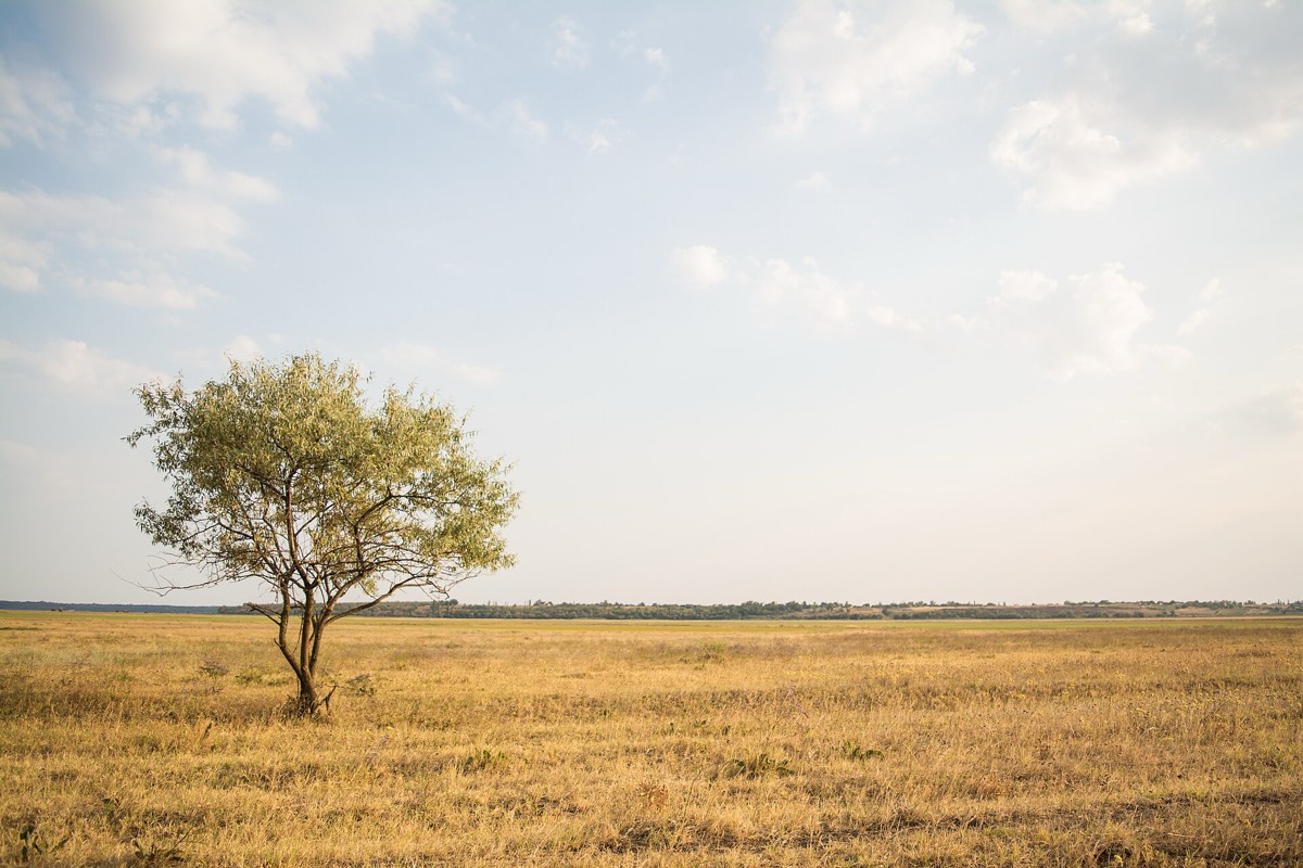 16:9, a banner9:16 from the centre9:16 on the tree1:1 on the tree
object-fit and object-position).Photo: Rodion Kutsaev, Wikimedia Commons (from Unsplash), CC0.
This is the tree from Composition, sitting on the left third, which is good composition. Cropped tall from the centre, the photo cuts the tree off at the edge and keeps mostly grass and sky, because the tree was never in the centre. Anchored on the tree, every ratio keeps it. The photo file is the same in all four; only the crop moves.
By default, both design tools and code crop from the centre:
- In Figma, an image set to Fill is cropped to the frame from the centre; with Crop you choose the area by hand, frame by frame.
- In CSS,
object-fit: coverfills the box and crops the rest, from the centre unless you say otherwise withobject-position(MDN, object-fit, MDN, object-position).
3. Give every photo a focal point
The fix is simple: for each photo, record where its subject is, as a point. Then every crop is anchored on that point instead of the centre.
.hero img {
  object-fit: cover;
  object-position: 12% 50%; /* the tree: near the left edge, half way down */
}
Many image services and content tools can store a focal point with the image and crop around it for you. Whether you use one or not, the decision is the same: someone has to say where the subject is. That someone is usually the designer.
When one photo can't work in every ratio, even with a focal point, use a different crop or a different photo for the tall version. That's called art direction, and Step 7 shows how to do it with <picture>.
4. Brief for the crops
If you commission a shoot, or choose stock, think about the crops before you have the photo:
- Shoot wider than you need. It's easy to crop in and impossible to crop out.
- Keep the subject away from the edges, so a tall or a square crop can still hold it.
- Ask for a vertical and a horizontal version of the key shots. Phones are tall.
- Leave copy space on the side where text will go (see Composition), in both versions.
5. Common mistakes
- Letting the code crop every image from the centre.
- Designing a hero only at desktop width, then discovering the phone crop cuts the subject.
- Cutting people at the joints (neck, wrists, knees) in tight crops; it looks accidental.
- Using one photo for every ratio when a second version would work better.
6. Vocabulary
| Term | Meaning |
|---|---|
| Aspect ratio | The proportion of width to height, like 16:9 |
| Crop | The part of a photo that's kept when it's fitted to a frame |
| Focal point | The point of the subject that every crop should keep |
| object-fit / object-position | CSS properties that decide how an image fills its box, and where it's anchored |
| Art direction | Showing a different crop or photo at different screen sizes |
7. Try it (no tools needed)
- Take a photo you like and print it, or open it full screen.
- Cut three paper windows: wide (16:9), square (1:1) and tall (9:16).
- Lay each window on the photo, first in the centre, then where it keeps the subject.
Reflection questions: Which ratio was hardest? Would you choose a different photo for that one?
8. If you already practise
- Add a focal point to every image in your design system's library, the way you add alt text. It's one more field, and it saves every crop after.
- In Figma, check heroes at the narrowest and widest frame before handing off; use Crop instead of Fill when the centre is wrong.
- In handoff notes, write the
object-positionfor each hero. Developers will thank you, and the phone crop will match the design.
Checklist
Learn more
- MDN: object-fit · object-position
Books, courses and videos to go deeper
Book links go to Amazon. As an Amazon Associate I earn from qualifying purchases, at no extra cost to you.
Related
Composition · Faces and gaze · Light and what it says · Audit the images in your product