Photography and Imagery · Labs · 2 min read
Art-direct a responsive hero
A guided lab: take one hero photo, set its focal point, plan the crops for phone, tablet and desktop, decide where a different crop is needed, and build it with object-position and picture. About an hour and a half.
One photo, three screens, one subject that never gets lost. You'll take a hero photo through every size it will live at, decide what has to stay, and build it in the browser. Most heroes only need a focal point. Some need a second crop. By the end you'll know which yours is.
What you'll do:
- Set a focal point on one hero photo
- Plan crops for phone, tablet and desktop
- Decide where a separate crop is needed
- Build it with
object-positionand, if needed,<picture>
You'll need: one hero photo (openly licensed or your product's own), a browser and a text editor or a free online code playground, about an hour and a half.
1. Find the subject and the focal point
Look at the photo and name, in two or three words, what must survive every crop: "the baskets of bread". Mark that point and write it as two percentages, from the left and from the top: here 50% 74%.
2. Plan the crops
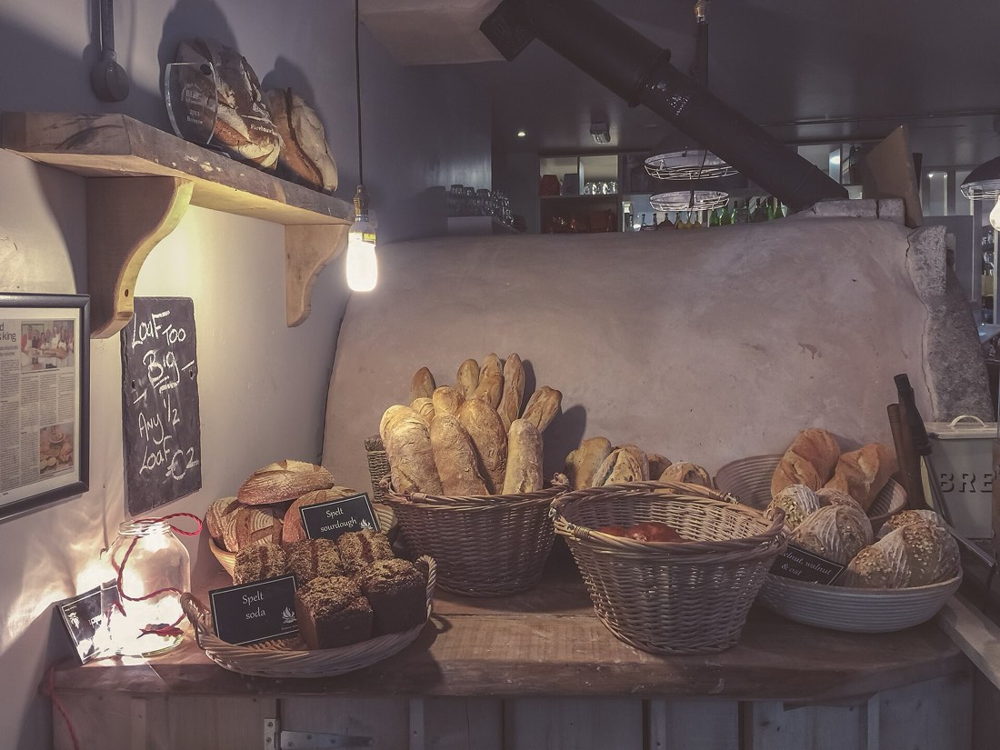 Desktop, 16:9Tablet, 1:1Phone, 4:5
object-position: 50% 74%). The bread stays in every crop; the bulb, the shelf and the chalkboard come and go.Photo: Drew Coffman, Wikimedia Commons (from Unsplash), CC0, credited in Step 3.Sketch, or crop in any editor, the photo at the ratios your layout uses, for example 16:9 on desktop, 1:1 on tablet and 4:5 on phones (see Crop and aspect ratio). Keep the focal point inside each one. For each crop, write what's gained and what's lost.
3. Decide: focal point or new crop?
- If every crop keeps the subject at a readable size, one file with a focal point is enough.
- If the phone crop turns the subject into a speck, or a text area covers it, plan a separate crop for small screens (art direction, see Responsive images and art direction).
Write down which, and the breakpoint where a second crop would take over.
4. Build it
The focal point version:
.hero img { width: 100%; aspect-ratio: 16 / 9; object-fit: cover; object-position: 50% 74%; }
@media (max-width: 560px) { .hero img { aspect-ratio: 4 / 5; } }
The art-directed version, if you need it:
<picture>
  <source media="(max-width: 560px)" srcset="hero-tall.jpg">
  <img src="hero-wide.jpg" width="1600" height="900" alt="…" fetchpriority="high">
</picture>
Add width and height, and fetchpriority="high", since a hero is usually the page's LCP (see Images and page speed).
5. Test it at every size
Open it in the browser and drag the window from wide to narrow, then open it on a real phone. Check:
- The subject stays visible and large enough at every width.
- Any text over the photo still sits in the safe area (see Scrims, safe areas and focal points).
- The page doesn't jump while the image loads.
6. Check your work
Reflection questions: At what width did the subject start to get lost? Would a different photo have been easier than a second crop?
Related
Responsive images and art direction · Crop and aspect ratio · Scrims, safe areas and focal points · Images and page speed