Photography and Imagery · Step 1 · 6 min read
What an image does in a product
Every image in a product has a job, or it is decoration. The five jobs an image can do, what the research says about first impressions and trust, and why a smiling face is not a trust button.
An image in a product has a job. If you can't say what the job is, it probably doesn't have one. That sounds harsh, but it saves a lot of time. A photo takes space, weight and attention, three things a screen never has enough of. Before you choose an image, decide what it has to do.
What you'll be able to do after reading:
- Name the job of any image on a screen
- Explain what the research says about first impressions, and what it doesn't say
- Stop using faces as a trust shortcut
- Give an image the size its job deserves, not the size the layout has free
1. Five jobs an image can do
Look at any product you like and you'll find images doing one of these:
| Job | What it does | Example |
|---|---|---|
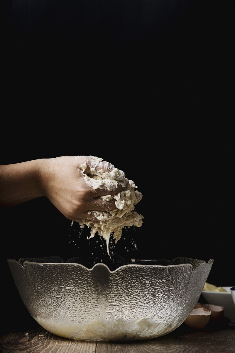
| Show the thing | Lets people see what they're getting | The product photos in a shop, the room in a booking site |
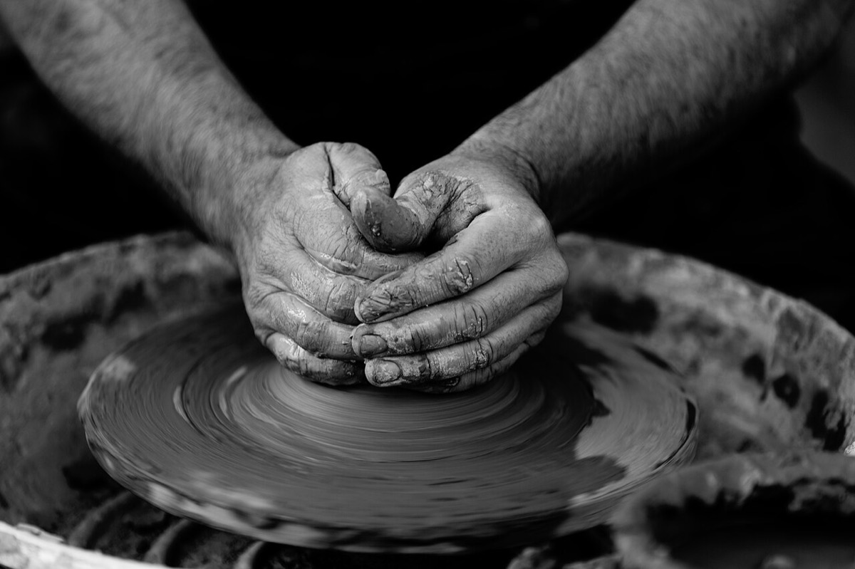
| Show how | Explains a step faster than words | "Where to find the code on your card", a cable going into the right port |
| Show who | Puts real people behind a service | The team page, the doctor's profile, the host of a flat |
| Orient | Helps people recognise where they are, at a glance | Category tiles, a map, the cover of a playlist |
| Set the mood | Gives the brand a feeling | The hero of a hotel site, an onboarding screen |
 Show the thing
 Show how
 Show who
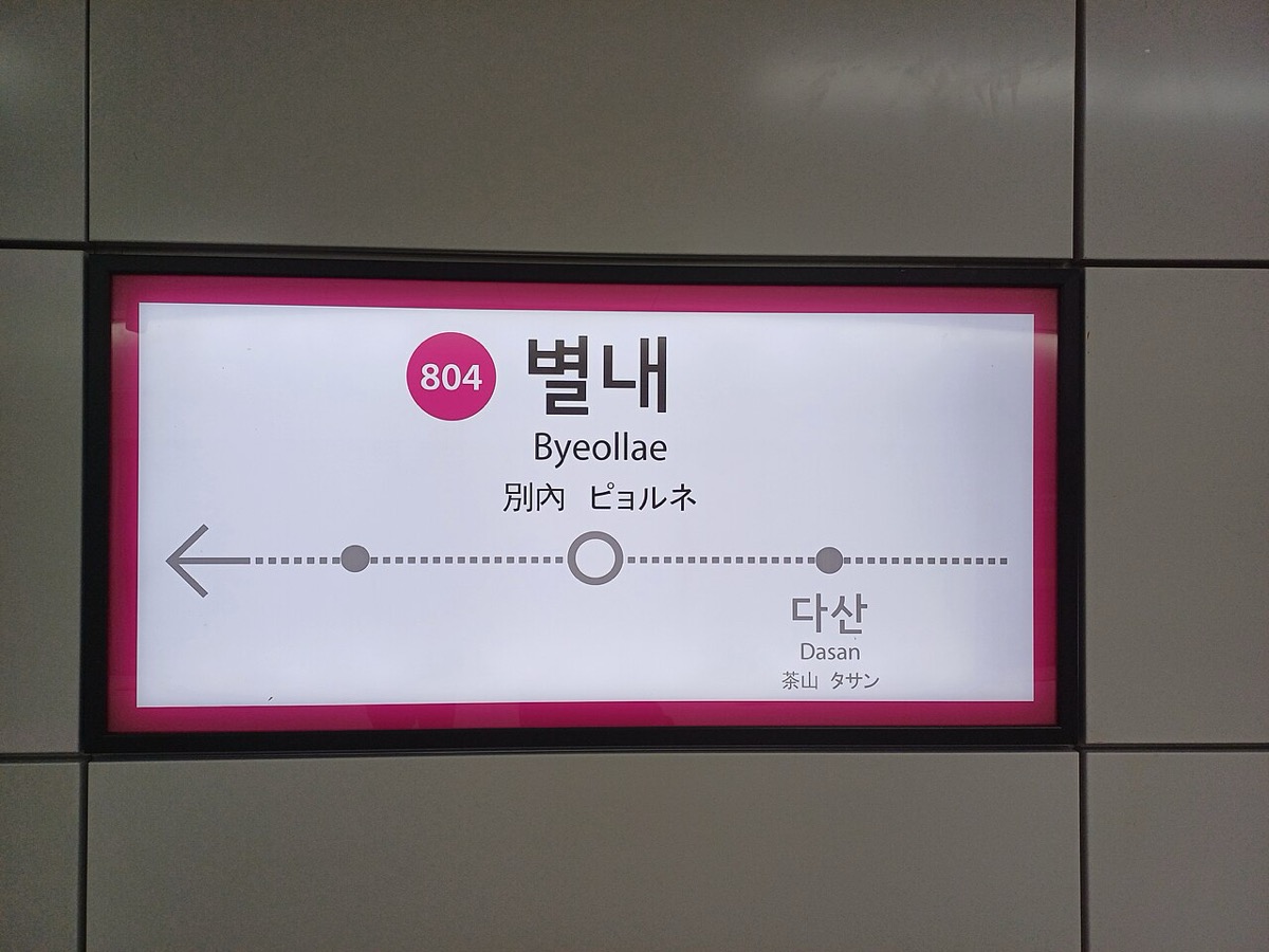 Orient
 Set the mood


The first four are content: people use them to decide or to act. The fifth is real too, but it's the easiest one to fake, and it's where most decorative photos hide. "It sets the mood" is a fine answer when you can say which mood, and why this screen needs it.
There's a sixth answer, and it's honest: "it fills the space." That's not a job. That's a layout with a hole.
2. First impressions are fast, and visual
Two studies are quoted a lot, so it's worth knowing what they found.
- 50 milliseconds. Lindgaard and colleagues showed web pages for 50 ms and then for 500 ms, and asked people to rate visual appeal. The ratings after 50 ms were highly correlated with the ratings after 500 ms: people form a visual impression almost instantly (Lindgaard et al., Behaviour & Information Technology, 2006).
- "The design look". When more than 2,500 people judged the credibility of real websites, the most common thing they commented on was the site's design look: 46.1% of the comments (Fogg et al., DUX, 2003).
Images are a big part of that look. But read the studies for what they are: they measure first impressions, not whether people trust you after using the product, and not whether they buy. A beautiful hero buys you a few seconds of goodwill. The rest of the product has to keep it.
3. A face is not a trust button
The most common shortcut in product imagery is "add a smiling person, people will trust us". The research is more interesting than that.
- Faces can help, indirectly. In an experiment with eye-tracking and interviews in Canada, Germany and Japan, websites with human images that showed faces were rated more appealing and gave more sense of "someone is there" (social presence), and that, in turn, raised trust. The images didn't raise trust directly, and the effect changed between cultures (Cyr et al., MIS Quarterly, 2009).
- Faces can also mislead. When photos of people were added to 12 online shops, they had no significant average effect on trust. Worse: they made people less able to tell the good vendors from the bad ones (Riegelsberger et al., CHI, 2003).
So the honest version is: real people, shown for a real reason, can make a service feel human. A stock model with a headset on a support page is not that. People have seen her on a hundred other sites. In The photos nobody looks at you'll see what eye-tracking says about her.
4. Size follows the job
A photo's size tells people how important it is. If the biggest thing on the screen is a photo with no job, you've told people the most important thing here is nothing.
Nielsen Norman Group shows this with large hero images: they attract the eye, but they hurt the experience when they push the main task down the page or make it look secondary (NN/g, Whitenton, Image-Focused Design: Is Bigger Better?, 2014). Their advice is to rank the goals of the page, for people and for the business, and give visual weight in that order.
A quick test: cover the image with your hand. If the main action becomes easier to find, the image is too big for its job.
5. Common mistakes
- Choosing the image before deciding its job.
- Using "it sets the mood" for every image, so nothing is content.
- Adding faces to "build trust" without a real person or a real reason.
- Letting a decorative hero push the main action below the fold.
- Quoting the 50 ms study as if it were about trust or sales.
6. Vocabulary
| Term | Meaning |
|---|---|
| Content image | An image people use to decide or act: the product, a step, a real person, a place |
| Decorative image | An image that adds feeling but no information; it could be removed without losing anything |
| Hero image | The large image at the top of a page |
| Social presence | The feeling that there are real people behind a website |
| Visual weight | How much attention an element draws, mostly from size, contrast and position |
7. Try it (no tools needed)
- Open a product you use every day, on your phone.
- For every image on the first two screens, write its job from the table above, in one word.
- Mark the ones where you can't name a job. Cover each with your thumb: does anything get lost?
Reflection questions: Which image in that product would you miss if it disappeared? Which one would nobody notice?
8. If you already practise
- In reviews, ask "what's the job of this image?" before "is it a good image?". It moves the discussion from taste to purpose.
- When a stakeholder asks for "more human" imagery, ask which real people the product can show: the team, real customers with consent, the people who do the work. If there are none, a stock face won't fill that gap.
- Keep the two trust studies above in your pocket. One says faces can help, the other says they can mislead. Both are true, and that's the point.
Checklist
Learn more
- Lindgaard et al., Attention web designers: You have 50 milliseconds to make a good first impression! (Behaviour & Information Technology, 2006)
- Fogg et al., How do users evaluate the credibility of Web sites? (DUX, 2003)
- Cyr et al., Exploring Human Images in Website Design: A Multi-Method Approach (MIS Quarterly, 2009)
- Riegelsberger et al., Shiny happy people building trust? (CHI, 2003)
- NN/g: Image-Focused Design: Is Bigger Better? (2014)
Books, courses and videos to go deeper
- Picture This: How Pictures WorkMolly BangBook · Chronicle Books, 25th anniversary edition, 2016 (Amazon)
- Design Is StorytellingEllen LuptonBook · Cooper Hewitt, 2017 (Amazon)
Book links go to Amazon. As an Amazon Associate I earn from qualifying purchases, at no extra cost to you.
Related
The photos nobody looks at · Photo, illustration or nothing · Audit the images in your product · Image role check