Photography and Imagery · Step 3 · 5 min read
One look for the whole product
Good photos from different sources rarely look like one product. How to make a set consistent (light, colour, grade, distance, people), how design systems write it down, and how to start an image style guide.
Ten good photos don't make a good product if they look like ten products. Each one can be well composed and well lit, and the screens still feel stitched together. Consistency is what makes imagery read as one voice. It doesn't come from choosing better photos; it comes from deciding a few things once and applying them everywhere.
What you'll be able to do after reading:
- Name the five things that make a set of photos look consistent
- Use one grade to pull mixed photos together
- Read how public design systems describe their imagery
- Write the first page of an image style guide
1. Same photos, one grade
 As found
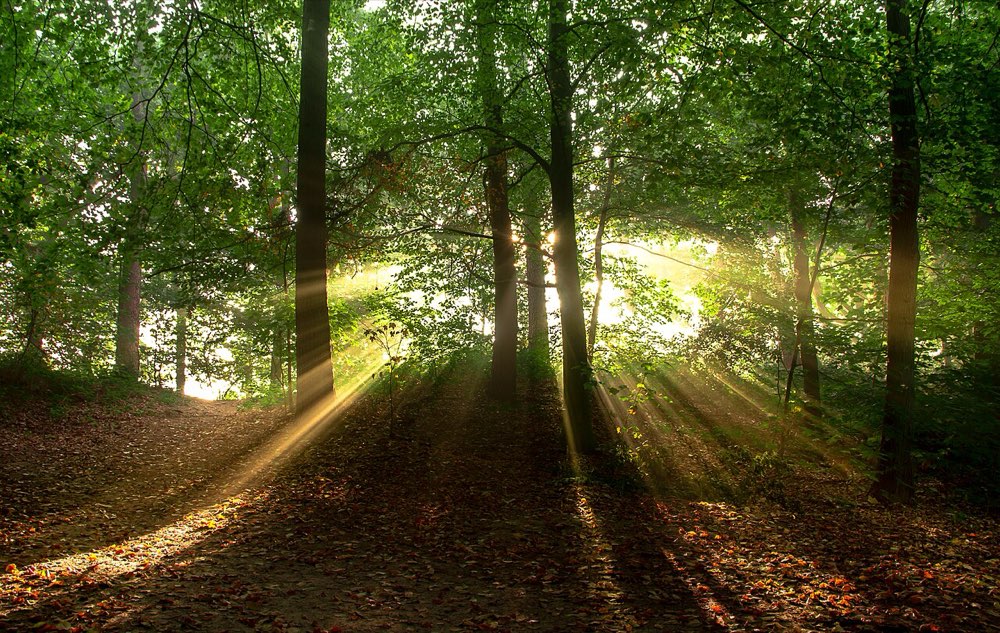 As found
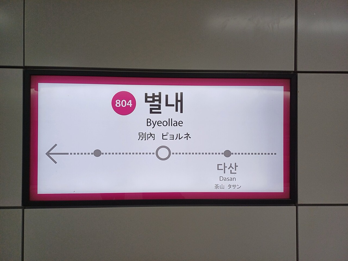 As found
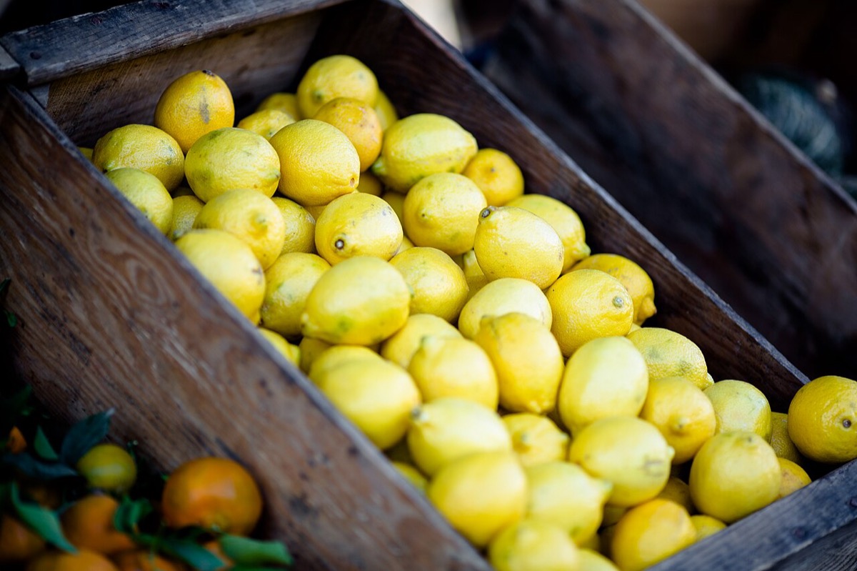 As foundOne gradeOne gradeOne gradeOne grade
The top row is four photos from four photographers, as found: warm, green, neutral and yellow, close and far, calm and busy. The bottom row is the same four with one treatment, black and white with a little more contrast. Nothing else changed, and they already feel closer. A grade is the cheapest form of consistency. Step 5 shows how to build one properly, with more than a filter.
2. Five things to keep the same
- Light: soft or hard, warm or cool (see Light and what it says).
- Colour: a palette or a grade, applied to every image.
- Distance: how close the camera is. Mixing tight details and wide landscapes on one screen feels random; mixing them on purpose (wide for heroes, detail for cards) feels designed.
- Point of view: eye level, from above, from below. Pick one or two.
- People: real or staged, looking at the camera or at the work (see Faces and gaze).
You don't need all five fixed. Two or three, held firmly, are enough for a set to read as one.
3. How design systems write it down
Public design systems are a good place to see consistency turned into rules:
- IBM Design Language describes three kinds of photo, each with a job: lifestyle photos that are editorial, "like frames from a film"; portraits of real people, all shot with the same care whatever their status; and still life for showing how things work and the details of products. It opens with a line worth borrowing: "everything communicates" (IBM Design Language, Photography).
- Material Design 2, no longer maintained but still clear, has pages on imagery, photography and image selection, with do and don't examples side by side.
- GOV.UK shows that a style guide can also be short and strict: use images only when users need them (GOV.UK Design System, Images).
4. The first page of an image style guide
You don't need a 40-page brand book. One page with these sections already helps:
- Our photos show: two or three sentences on subject and point of view. "Real bakers at work, close to the bread, in our own shops."
- Light and colour: the grade, in words and with one before and after.
- Sources: where photos may come from (see Library, shoot or generated).
- People: who appears, how, and with which permissions (see People in images).
- Do and don't: three pairs of examples, from your own product.
- Crops and focal points: the ratios you use and how to mark the subject (see Crop and aspect ratio).
Put it where designers already look: in the design system, next to colour and type.
5. Common mistakes
- Choosing each photo on its own merits, never as part of a set.
- Mixing warm and cool, close and far, on the same screen.
- Writing a style guide with adjectives ("authentic, vibrant") and no examples.
- Grading new photos but leaving the old ones as they were.
6. Vocabulary
| Term | Meaning |
|---|---|
| Grade | A colour and tone treatment applied the same way to a set of images |
| Point of view | Where the camera stands: eye level, above, below |
| Image style guide | The written rules for a product's photos, with examples |
| Set | The images that appear together, on a screen or across a product |
7. Try it (no tools needed)
- Screenshot every photo on the home screen of a product you use.
- Put them side by side and sort them by light (warm to cool) and by distance (close to far).
- Write the two rules that would make them look like one set.
Reflection questions: Which photo breaks the set the most? Is it the best photo of them all?
8. If you already practise
- Review images as a set: lay out every image of a flow on one board before approving any.
- Build the grade once, as a preset in your editor or a token in code, and apply it to old images too, not just new ones.
- Show the style guide with your own before and after. Borrowed examples convince less.
Checklist
Learn more
- IBM Design Language: Photography · Illustration
- Material Design 2: Imagery · Photography · Image selection
- GOV.UK Design System: Images
Books, courses and videos to go deeper
- Interaction of ColorJosef AlbersBook · 50th anniversary edition (Yale University Press, 2013) (Amazon)
- Graphic Design: The New BasicsEllen Lupton and Jennifer Cole PhillipsBook · 2nd edition (Princeton Architectural Press, 2015) (Amazon)
Book links go to Amazon. As an Amazon Associate I earn from qualifying purchases, at no extra cost to you.
Related
Library, shoot or generated · People in images · Light and what it says · Crop and aspect ratio