Photography and Imagery · Step 5 · 5 min read
Treatment with a purpose
Every grade, blend, grain and mask should earn its place. How to tell a treatment that helps a photo do its job from one that's decoration, the switch-off test, when treatment hides information, and the extra rules for photos that are records and for generated images.
If you can switch a treatment off and nobody notices, it wasn't doing anything. The last four lessons gave you the tools. This one is about restraint. A treatment should help the photo do its job, or help many photos look like one product. Anything else is decoration, and decoration on photos ages fast.
What you'll be able to do after reading:
- Tell a purposeful treatment from decoration, with one test
- Spot when a treatment removes information people need
- Know the limits of treating photos that are records
- Write the treatment rules for your product
1. A little, or everything
 Treated: a light gradeOver-treated: everything at once

Both versions use what you learned in this step. The first used one: a light grade. The second used all of it at once. It isn't ugly by accident; it's what happens when each treatment is chosen because it's available, not because the photo needed it. Now the effect is what you see, and the tracks are what you have to look for.
2. Three reasons to treat
A treatment earns its place when it does one of these:
- It helps the photo's job (see What an image does in a product): a scrim so the headline reads, a crop so the subject shows, a grade that sets the mood the page needs.
- It makes many photos one set: one grade, one grain, one duotone across photos from different sources, as in One look for the whole product.
- It fixes a defect: banding in a gradient, a colour cast, a photo that's too dark.
"It looked more interesting" is not on the list. Neither is "the other designer did it".
3. The switch-off test
Before you ship a treatment, switch it off and compare:
- If the page is worse without it, keep it.
- If it's the same, remove it: it costs files, paint and attention for nothing.
- If it's better without it, you already know.
In CSS this takes a second, because the treatment is a class on an untouched file. That's the practical reason the last four lessons did everything in CSS.
4. When colour is the information
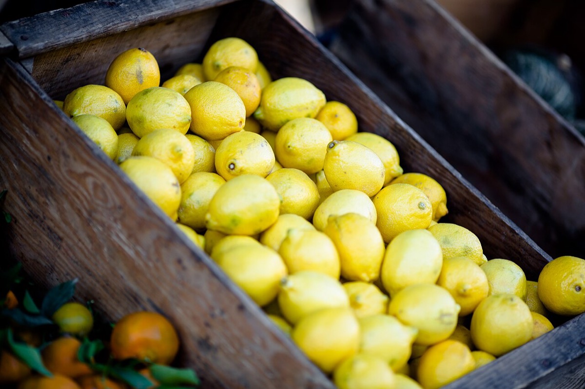 As found: the colour is the informationDuotone: you can't tell if they're ripe

Some photos are there to show exactly how something looks: food, clothes, paint, skin, a room for rent. Treat them and you remove the information they carry. A duotone on a campaign is a style; on a product listing, it's a photo that can't answer the buyer's question.
The same goes further for photos that are records. A news photo, a photo of a damaged parcel, a before-and-after: people trust them to show what was there. Correcting exposure is fine; changing what's in the photo is not. It's the same line drawn in What changes when the image is generated for generated images.
5. Treating generated images
Generated images get treated too: a grade to match the product, a crop, grain to hide their too-smooth surfaces. Two rules:
- The label stays. A treated generated image is still generated. Don't let a grade or a crop remove the label or the Content Credentials (see Labels and provenance).
- Treatment is not disguise. Adding grain so a generated image "looks more like a real photo" moves it towards deception, not towards the product's look.
The AI for UX track covers AI tools for editing images, and their limits, in AI for visual design: images and video.
6. Writing it down
The rules from this step fit in a few lines of the image style guide:
Grade: saturation 92%, contrast +4%, on every photo. Duotone: campaigns only, pairs A or B. Grain: fine, overlay at 35%, heroes only. Masks: rounded inset, circle for people. Never: treatments on product photos beyond exposure and white balance.
Write it as values and examples, not adjectives. "Warm and natural" means something different to every designer; "saturation 92%" doesn't.
7. Common mistakes
- Using every treatment you know on one image.
- Treating product photos until the product's colour is wrong.
- A grain to make a generated image look "real".
- Treatment rules that live in one designer's head.
8. Vocabulary
| Term | Meaning |
|---|---|
| Treatment | Any change laid over a photo: grade, blend, grain, mask, scrim |
| Decoration | A treatment with no job, added because it was available |
| Record | A photo people trust to show what was really there |
| Switch-off test | Removing a treatment to see if the page gets worse |
9. Try it (no tools needed)
- Pick five treated images from a product or a site you like.
- For each, name the treatment and which of the three reasons it serves, if any.
- Imagine each one with the treatment switched off.
Reflection questions: How many passed the switch-off test? Was there one where the treatment hid something you'd want to see?
10. If you already practise
- Add the switch-off test to design reviews: show every treated image once without its treatment.
- Write your product's treatment rules into the image style guide, with the CSS next to each.
- Mark product and record photos in your image library, so nobody treats them by accident.
Checklist
Learn more
- MDN: filter · mix-blend-mode · mask-image
Books, courses and videos to go deeper
Book links go to Amazon. As an Amazon Associate I earn from qualifying purchases, at no extra cost to you.
Related
One look for the whole product · What an image does in a product · What changes when the image is generated · Labels and provenance · Grade, black and white and duotone