Photography and Imagery · Labs · 2 min read
Audit a hero for legibility
A guided lab: take a real text-over-image component, collect its hardest photos, measure the contrast at the worst spot by hand, and fix it with one change that works for all of them. About an hour, with a browser and a free contrast checker.
The mockup always passes. The fifth photo is the one that fails. You'll audit one real hero, card or banner with text on a photo, the way it lives in production: with every photo it carries, at every size. Then you'll fix it once, for all of them.
What you'll do:
- Pick a text-over-image component and collect its photos
- Find and measure the worst spot on each
- Fill in an audit sheet
- Propose one fix that passes on every photo
You'll need: a browser, a free contrast checker such as WebAIM's, an eyedropper (browser developer tools, Figma or any image editor), about an hour.
1. Pick the component and its photos
Choose a component with text on a photo, from your product or a site you use. Collect four or more photos it really carries: the calm one from the mockup, the lightest, the busiest, the most colourful.
2. Find the worst spot
For each photo, look behind the text for the part most like the text (see Measuring contrast on a photo): the brightest area behind white text, the darkest behind dark text. Check at the smallest screen size too: the crop moves.
3. Measure and fill in the sheet
| Photo | Text | Worst spot | Contrast | Result | Fix |
|---|---|---|---|---|---|
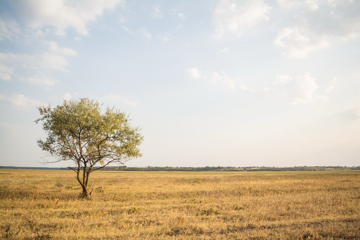 | White headline, bottom | The light grass behind the first words | 1.7 to 1 | Fails | Scrim from the bottom: 8.9 to 1 |
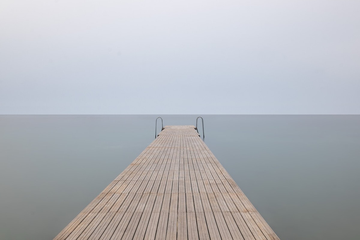 | White headline, bottom | The pale sea beside the pier | 2.0 to 1 | Fails | Same scrim: 9.4 to 1 |
 | White headline, bottom | The gold reflection on the water | 3.6 to 1 | Fails | Same scrim: 12 to 1 |
| White headline, in the sky | The pale sky | 1.2 to 1 | Fails | Dark headline in the same place: 8.5 to 1 |
Pick the colour of the worst spot with the eyedropper, and check it against the text colour in the contrast checker. Fill in one row per photo: where the text sits, the worst spot, the ratio, pass or fail. Use 4.5 to 1 for normal text and 3 to 1 for large text.
The sheet above is a worked example, with the numbers measured on this course's own figures.
4. Propose one fix
Choose the fix that passes on every row, from the gentlest (see Scrims, safe areas and focal points):
- Move the text to a calmer place, or change its colour.
- Add a scrim tuned for the worst photo.
- Add a box behind the text.
Write the fix as a rule for the component, not a note for one photo: "scrim from the bottom, 85% at the edge, gone by half height".
5. Check it on all of them
Apply the fix, at least in a quick mockup, to every photo in your set and measure again. If one still fails, strengthen the fix, or decide that photo can't be used in this component and write that down.
6. Check your work
Reflection questions: Did the mockup photo pass? Which photo would you never have tested if you hadn't gone looking for it?
Related
Measuring contrast on a photo · Scrims, safe areas and focal points · Masks, clip paths and scrims · Images in dark mode · Text-over-image contrast check