Photography and Imagery · Step 5 · 5 min read
Grade, black and white and duotone
Treating an image starts with its colour. What a grade changes in how a photo feels, when black and white helps and when it hides, how duotone makes different photos read as one set, and how to do all three in CSS without touching the file.
A treatment is a layer, not a filter you forget about. Every change you make to a photo's colour, light or texture sits on top of the original, and you should be able to name it, switch it off and ask if the photo is better with it. This step is about those layers. The first one is the one people notice least and feel most: colour.
What you'll be able to do after reading:
- Explain what a grade is and what it changes in how a photo feels
- Decide when black and white helps a photo and when it removes the point
- Build a duotone and know what it costs
- Do all three in CSS, on the original file
1. One photo, four grades
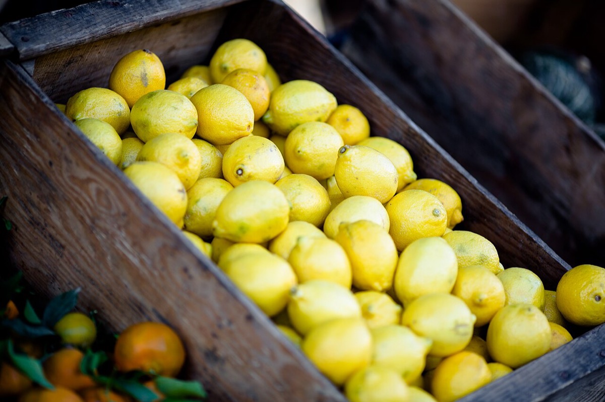 As foundThe photo's own colourWarmRiper, sunnierCoolFresher, a little clinicalBlack and whiteShape and light only

A grade is a change to a photo's colours as a whole: warmer or cooler, more or less saturated, more or less contrast. The word comes from film, where colourists grade every shot of a film so it feels like one story.
The lemons show why it matters. The fruit didn't change; the feeling did. Warm says ripe, sunny, market. Cool says fresh, clean, a little clinical. Black and white says "this is about shape and light", and in a photo of lemons, that's a strange thing to say. Remember Light and what it says: light sets the mood, and a grade is how you adjust it afterwards.
In CSS, a grade is a line or two on the image, and the file stays as it was (MDN, filter):
.warm { filter: sepia(.3) saturate(1.25) brightness(1.03); }
.cool { filter: saturate(.8) brightness(1.04) contrast(.95); }
.cool::after { content: ""; position: absolute; inset: 0;   /* a blue layer, see the next lesson */
               background: #3d6fd6; mix-blend-mode: soft-light; opacity: .55; }
.bw   { filter: grayscale(1) contrast(1.1); }
2. When black and white helps
Black and white takes colour away, so it helps when colour was the noise and hurts when colour was the message.
- It helps when photos from different sources clash. In One look for the whole product four photos became one set with a single black and white grade.
- It helps when the subject is shape, texture or a gesture: hands, faces, architecture.
- It hurts when colour is the information: food, clothes, paint, a map, a product someone will buy. More on this in Treatment with a purpose.
Add a little contrast when you go grey: colour separates things that grey alone can merge, and contrast gives the separation back.
3. Duotone: two colours, one set
Lemons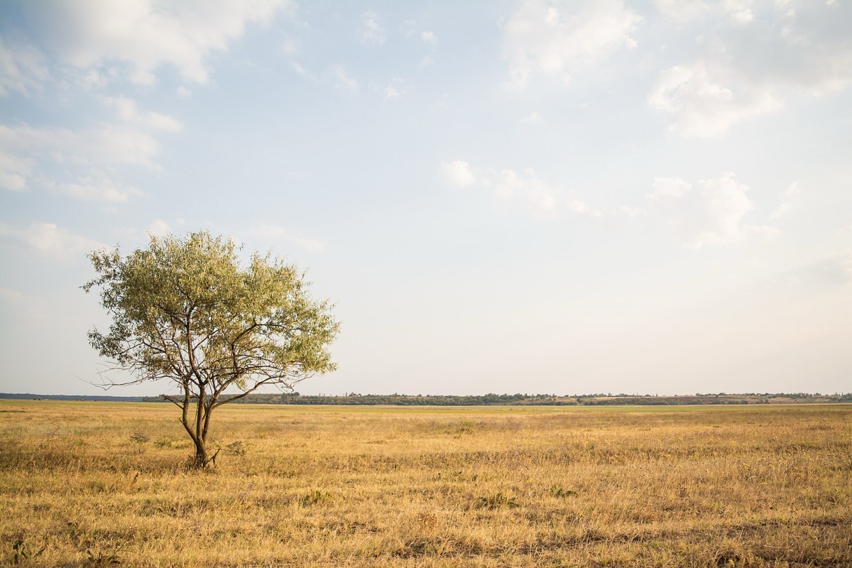 Grassland
 Mug


A duotone maps a photo's darks to one colour and its lights to another. It started in print, with two inks; in products it became a way to make unrelated photos look like they belong to one brand.
It works because it removes the thing that makes photos from different sources clash: their colour. The cost is the same: no photo keeps its real colour. Use it for mood, campaigns and editorial pages; avoid it where people need to see what something really looks like.
In CSS, a duotone is three layers: the light colour behind, the photo in grey multiplied over it, and the dark colour on top in lighten mode. The next lesson explains why multiply and lighten do exactly this.
.duo        { background: #f2d36b; isolation: isolate; }          /* the light colour */
.duo img    { filter: grayscale(1) contrast(1.15); mix-blend-mode: multiply; }
.duo::after { content: ""; position: absolute; inset: 0;
              background: #2b2a6b; mix-blend-mode: lighten; }   /* the dark colour */
Pick the two colours like text and background: the dark one has to be dark enough, and the light one light enough, or the photo turns to mush.
4. Why CSS and not a new file
You can bake a grade into the file, in an editor, or apply it in CSS. Both are fine. CSS keeps the original, so you can change the grade across the whole product in one line, and switch it off to compare. A baked file is simpler to serve and looks the same everywhere, including in emails and shared links. Many teams do both: CSS while they decide, baked files once the look is fixed.
Whichever you choose, keep the original. A grade you can't undo is a decision you can't revisit.
5. Common mistakes
- A grade per photo, chosen by whoever uploaded it, so the product has ten looks.
- Black and white on photos where colour was the reason to show them.
- A duotone with two colours too close in lightness: a flat, muddy picture.
- Throwing away the original after baking a grade.
6. Vocabulary
| Term | Meaning |
|---|---|
| Grade | A change to a photo's colour and contrast as a whole |
| Saturation | How strong the colours are, from grey to vivid |
| Colour temperature | How warm (orange) or cool (blue) the light looks |
| Duotone | A photo shown in two colours: one for the darks, one for the lights |
| Baked | A treatment saved into the image file itself |
7. Try it (no tools needed)
- Open three photos from the same product or site.
- For each, write one word for its mood as it is.
- Imagine all three in one black and white grade, then in one duotone of your brand colours. Which would they lose, and which would gain?
Reflection questions: Is there a photo where colour is the whole point? What would you tell a teammate who wanted to put it in duotone?
8. If you already practise
- Write the product's grade into the image style guide as values, not adjectives: "saturation 90%, contrast +5%", or the CSS itself.
- Keep two or three approved duotone pairs, tested for contrast like any colour pair.
- Apply the grade in one shared class, so changing it later is one edit.
Checklist
Learn more
- MDN: filter · mix-blend-mode · isolation
- W3C, Filter Effects Module Level 1, where the CSS filters are defined
Books, courses and videos to go deeper
- Interaction of ColorJosef AlbersBook · Yale University Press, 50th anniversary edition, 2013 (Amazon)
- Color and Light: A Guide for the Realist PainterJames GurneyBook · Andrews McMeel, 2010 (Amazon)
Book links go to Amazon. As an Amazon Associate I earn from qualifying purchases, at no extra cost to you.
Related
One look for the whole product · Light and what it says · Blend modes and the maths behind them · Treatment with a purpose