Photography and Imagery · Step 6 · 5 min read
Scrims, safe areas and focal points
How to make a text-over-image component pass on every photo and every screen: a scrim tuned for the worst image, a safe area where text may go, and a focal point that keeps the subject in the crop. With the CSS for each.
Make the component pass, not the photo. In the last lesson the same headline passed on one photo and failed on others. You can't fix that photo by photo, because the next one is already on its way. You fix it once, in the component: a scrim strong enough for the worst image, a safe area where text is allowed, and a focal point so the crop keeps the subject.
What you'll be able to do after reading:
- Tune a scrim for a set of photos, not one
- Choose between a gradient, a blur, a box and a text shadow
- Define a safe area for text in an image component
- Keep the subject in the crop with
object-fitandobject-position
1. One scrim for every photo
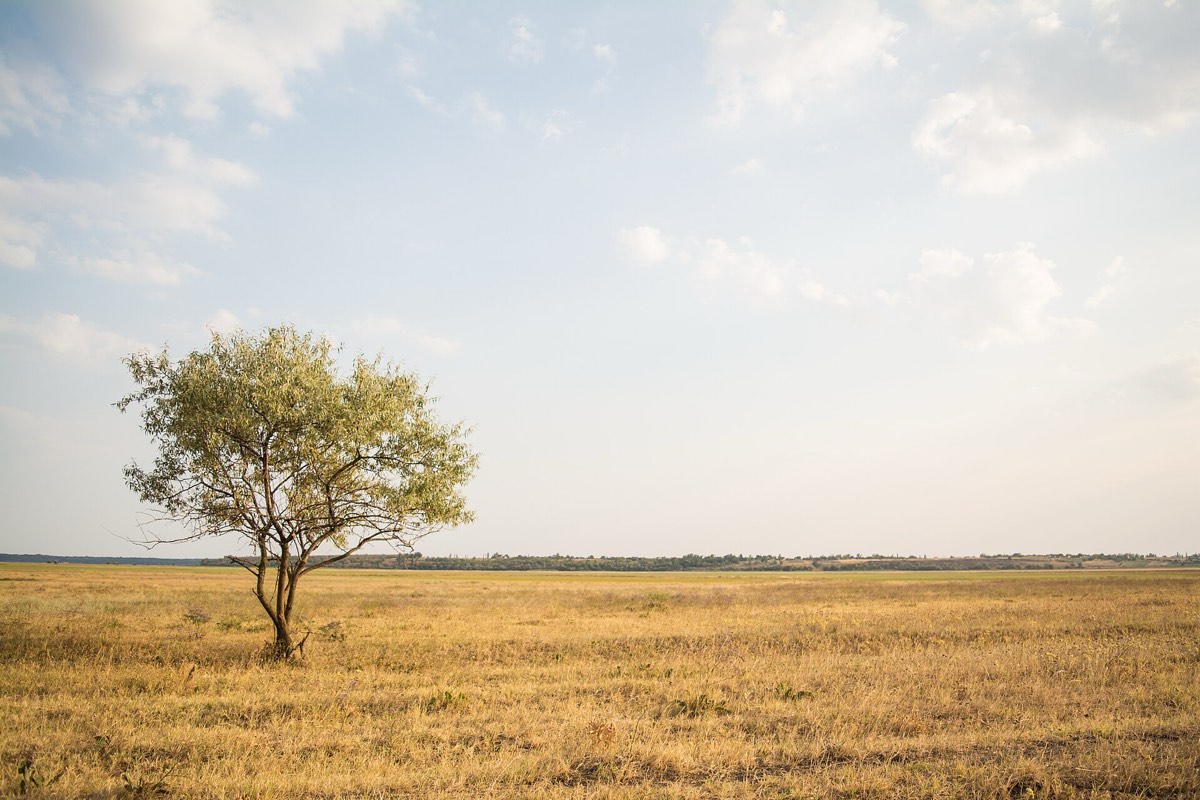 Grassland: 8.9 to 1
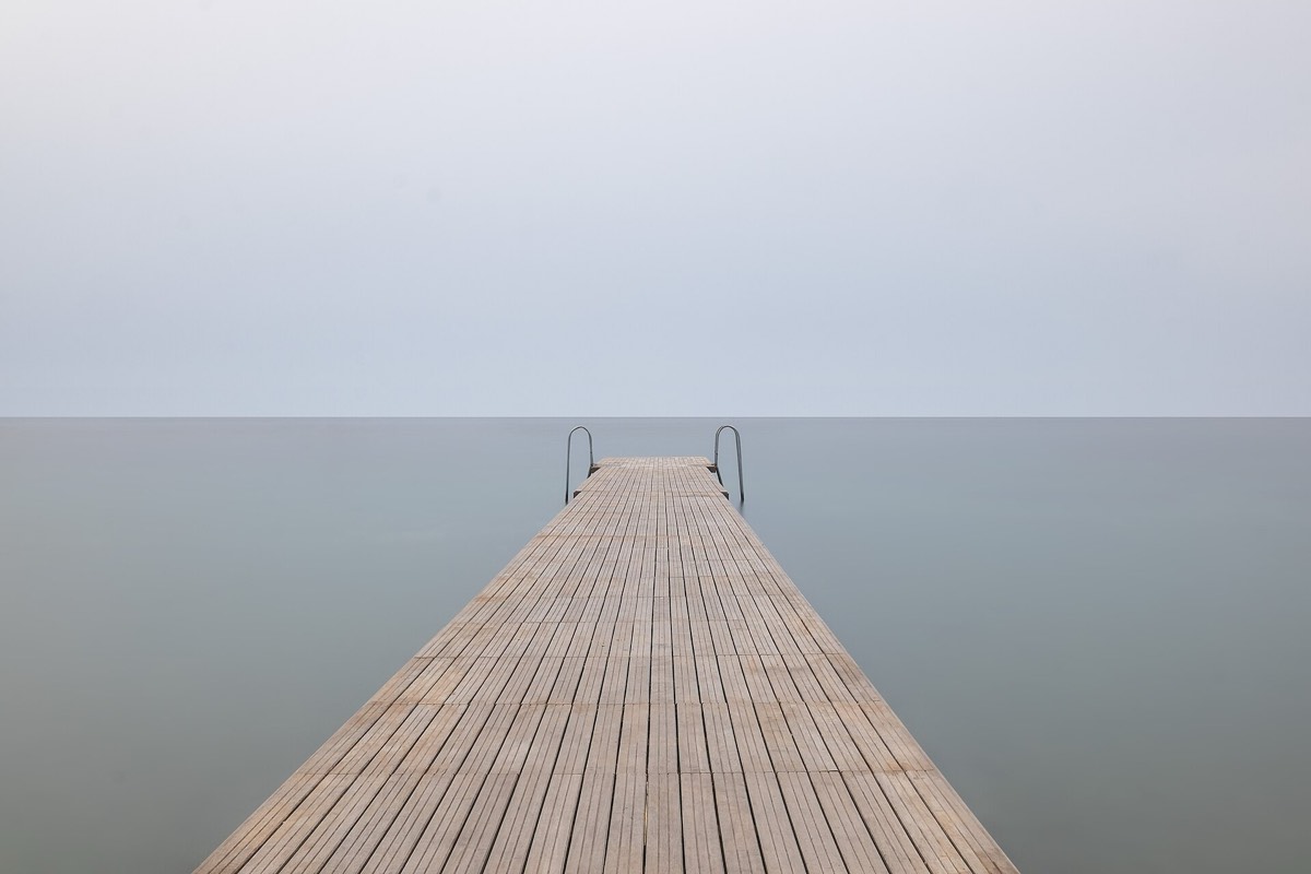 Pier: 9.4 to 1
 Sunset: 12 to 1


The same three photos from the last lesson, now with one scrim. It was tuned on the worst photo, then checked on the others. That's the method:
- Put the component's text on the worst photo in your set.
- Strengthen the scrim until the lightest spot behind the text passes 4.5 to 1 (see Measuring contrast on a photo).
- Check that the scrim doesn't darken the subject of the other photos more than it must.
- Make that scrim part of the component, as a token, so nobody draws their own.
.hero { position: relative; isolation: isolate; }
.hero::after { content: ""; position: absolute; inset: 0;
  background: linear-gradient(to top, rgb(10 10 12 / .85), rgb(10 10 12 / .55) 28%, transparent 52%); }
.hero h2 { position: absolute; z-index: 1; left: 6%; right: 6%; bottom: 8%; color: #fff; }
The stops matter as much as the colour: dark where the text is, gone before the subject. Ahmad Shadeed's article on text over images walks through the gradient options and warns that a gradient is easy to add and easy to get wrong for accessibility (Ahmad Shadeed, Handling Text Over Images in CSS, 2021).
2. Four ways to help the text
NN/g lists the usual techniques: a semi-opaque overlay over the whole image or only behind the text, a blur, a text shadow or outline, or a mix (NN/g, 2015). In short:
- Gradient scrim, the "floor fade": dark at the edge with the text, clear elsewhere. The most common and the least intrusive.
- Blur behind the text, with
backdrop-filter: blur()on the text's box: calm without darkening (MDN, backdrop-filter). Check the contrast anyway: blur makes the background even, not dark. - A solid or semi-opaque box: always works if it's opaque enough, and looks the most like a label.
- Text shadow: a help for the edges of letters, not a fix on its own over a light photo.
3. The safe area
Wide: text in the empty skyTall, from the centreTall, from the focal pointobject-position, the subject stays and the sky above it is still free for the words.Photo: Rodion Kutsaev, Wikimedia Commons (from Unsplash), CC0.A safe area is the part of the image where text is allowed, at every size. Inside it, the component promises contrast and no subject; outside it, the photo is free. The figure draws it as a dashed frame; in a design system it's a rule in the component, like "text in the top third, never over the focal point".
It changes what you ask of photos, too. Write it into the image brief (see The image brief and the shot list): "leave calm space in the top third for a headline" is something a photographer, or a prompt, can deliver.
4. The focal point
When the layout crops a photo to fit, CSS decides what stays. Two properties do the work (MDN, object-fit, MDN, object-position):
.hero img { width: 100%; height: 100%; object-fit: cover; }   /* fill the box, crop the rest */
.hero img { object-position: 20% 50%; }                        /* keep the tree, at 20% from the left */
object-fit: cover fills the box and crops what doesn't fit. object-position says which part of the photo to keep, and the default is the centre, which is rarely where the subject is. Store the focal point with the image, in your image library, next to the alt text and the licence (see Crop and aspect ratio), and let the component read it.
5. Common mistakes
- A scrim tuned on the mockup photo.
- A scrim so strong it turns every photo into a dark rectangle.
- A blur with no contrast check.
- Text placed over the subject on small screens, because nobody set a focal point.
- Every designer drawing their own gradient.
6. Vocabulary
| Term | Meaning |
|---|---|
| Scrim | A gradient or tint behind text on a photo |
| Floor fade | A scrim that darkens only the bottom of the image |
| Safe area | The part of an image where text is allowed at every size |
| Focal point | The point of the photo the crop must keep |
| object-position | The CSS property that sets which part of a cropped image stays |
7. Try it (no tools needed)
- Take a text-over-image component from your product.
- Find its three hardest real photos: the lightest, the busiest, the one with the subject where the text goes.
- Sketch where the safe area would be, and what the scrim would need to do for all three.
Reflection questions: Could one scrim work for all three? If not, which photo should leave the set?
8. If you already practise
- Make the scrim a token with one or two strengths, tested on a worst-photos set.
- Store a focal point and a text position with every image, and use them in the component.
- Add the safe area to the image brief, so new photos arrive ready for text.
Checklist
Learn more
- Ahmad Shadeed, Handling Text Over Images in CSS (2021)
- Aurora Harley, Ensure High Contrast for Text Over Images (NN/g, 2015)
- MDN: object-fit · object-position · backdrop-filter
Related
Measuring contrast on a photo · Masks, clip paths and scrims · Crop and aspect ratio · The image brief and the shot list · Text-over-image contrast check