UX Foundations · Step 7 · 7 min read
Inclusive design
Accessibility sets the minimum; inclusive design is the way of working that gets you there and further. Microsoft's three principles, permanent, temporary and situational needs, the true story of the curb cut, designing with people instead of for them, and how language, culture, age and reading skills change a design.
Every design decision includes some people and leaves others out. A tiny tap target leaves out someone with a tremor; an idiom leaves out someone reading in a second language; a "first name, last name" form leaves out people whose names don't work that way. Inclusive design is the habit of asking, early and often, "who can't use this?", and then fixing it with those people, not on their behalf.
What you'll be able to do after reading:
- Explain inclusive design and how it relates to accessibility
- Use the permanent, temporary and situational spectrum
- Tell the curb-cut story accurately, and what it means for products
- Plan to design with people, not for them
- Check a design for language, culture, age and reading level
1. Exclusion is a mismatch
Microsoft's Inclusive Design toolkit starts from a different idea of disability: "Disability happens at the points of interaction between a person and society", and exclusion "is the result of mismatched interactions" (Microsoft, Inclusive 101). If the problem is the mismatch, the designer can change one side of it.
The toolkit has three principles (Microsoft Inclusive Design):
| Principle | What it asks of you |
|---|---|
| Recognize exclusion | Look for the people your design leaves out, and for your own bias. "Exclusion happens when we solve problems using our own biases" |
| Learn from diversity | Put people with different experiences at the centre of the process |
| Solve for one, extend to many | Design well for one excluded group; the solution often helps many more |
How it relates to accessibility (the course's framing): accessibility is the result you can test, such as WCAG AA. Inclusive design is the method: who you involve, which questions you ask, and how early. You need both. See Accessibility fundamentals.
2. Permanent, temporary, situational
The toolkit's Persona Spectrum shows that one need appears in many lives. Its example: "a device designed for a person who has one arm could be used just as effectively by a person with a temporary wrist injury" "or a new parent holding an infant" (Microsoft, Inclusive 101).
A lasting condition.
Design for this person firstA few weeks in a cast.
Same need, for a whileHolding a baby in one arm.
Same need, for a momentThe same pattern works for other senses, in the course's own examples:
| Need | Permanent | Temporary | Situational |
|---|---|---|---|
| See | Blind or low vision | Eye drops after a check-up | Phone in bright sunlight |
| Hear | Deaf | Ear infection | A noisy train |
| Focus | ADHD | Lack of sleep | A child asking questions while you fill a form |
| Read | Dyslexia | A painkiller that blurs attention | A form in your second language |
Design for the left column first. It is the strictest, and the others follow.
3. The curb-cut effect
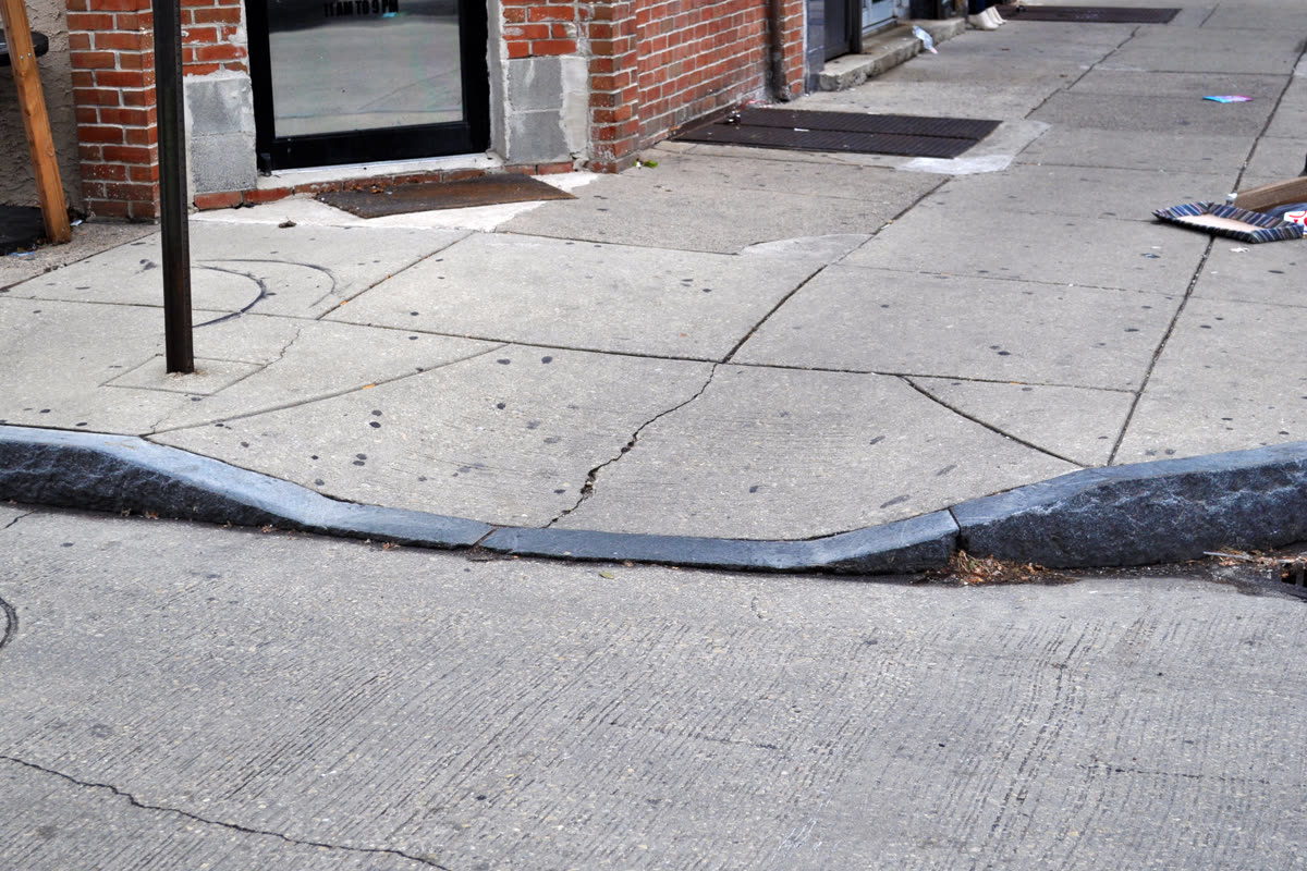

The history, as Angela Glover Blackwell tells it in Stanford Social Innovation Review (Winter 2017): curb cuts were "not an entirely new invention", since "the first appeared in 1945, in Kalamazoo, Mich." In the early 1970s in Berkeley, California, disability activists, among them Michael Pachovas, poured cement into a crude ramp at a kerb as a protest, and "in 1972 the city installed its first official 'curb cut' at an intersection on Telegraph Avenue" (Blackwell, The Curb-Cut Effect). Blackwell calls it the "curb-cut effect": changes made for one group that end up benefiting everyone.
Two lessons for designers: the change came from disabled people demanding it, not from planners being kind; and the benefit to everyone came after solving well for one group, not by designing for "average".
4. Design with, not for
"Nothing about us without us" is a rallying cry of the disability rights movement; James Charlton used it as the title of his 1998 book, built on interviews with activists around the world (University of California Press).
- 1Find who is left out
Ask who can't use this today, and why.
- 2Invite them early
Before the first sketch, not after launch.
- 3Design together
Sketch, ask, change; pay people for their time.
- 4Test with them
Watch real use with their own tools.
What you learn from one group often helps many others.
In practice, W3C advises: "Involving people with disabilities throughout your design and development process can be more effective" than one formal test at the end, and "Avoid assuming that input from one person with a disability applies to all people with disabilities" (W3C WAI, Involving Users in Evaluating Web Accessibility, 2021).
Three practical rules (course advice):
- Recruit on purpose. Add disabled people, older people and low-literacy readers to your usual research panel. See Short user interviews and Usability testing with five people.
- Pay them like any other participant, and let them use their own devices and settings.
- Share credit and decisions. If they shaped the design, say so.
5. Language, culture, age and reading
Inclusion isn't only about disability.
- Age. The WHO says "By 2030, 1 in 6 people in the world will be aged 60 years or over" (WHO, Ageing and health, 2025). Eyesight, fine motor control and patience with novelty change; bigger text and targets help.
- Low literacy and cognition. W3C's guidance for cognitive and learning disabilities asks for "easy words, short sentences and blocks of text, clear images" (W3C, Making Content Usable for People with Cognitive and Learning Disabilities, 2021). Plain words help every reader in a hurry. See Content first.
- Language and culture. Avoid idioms and jokes that don't translate; leave room for longer words in other languages; don't rely on a colour meaning the same everywhere.
- Names and formats. W3C's internationalisation article suggests it is often "simpler, where it is possible, to just use the full name as the user provides it" (W3C, Richard Ishida, Personal names around the world). The same goes for addresses, dates and phone numbers.
AI features raise the same questions with new risks: see Accessibility with and for AI and Ethics, bias and inclusion in AI design.
6. Common mistakes
- Designing for an "average user" who doesn't exist.
- Treating inclusion as a persona with a wheelchair icon, added at the end.
- Asking one disabled colleague to speak for all disabled people.
- Using idioms, jargon and long sentences in the interface.
- Forms that assume one name format, one address format or two genders.
- Calling the curb-cut effect a happy accident; it took activists to make it happen.
7. Vocabulary
| Term | Meaning |
|---|---|
| Inclusive design | A way of working that involves excluded people to design for a wider range of people |
| Exclusion | When a design doesn't match someone's abilities, context or culture |
| Persona Spectrum | Microsoft's tool linking permanent, temporary and situational needs |
| Situational limitation | A barrier caused by context, such as sunlight or noise |
| Curb-cut effect | A change made for one group that ends up helping many |
| Co-design | Designing together with the people affected, not only testing on them |
| Plain language | Words and sentences most readers understand on first reading |
8. Try it (no tools needed)
- Pick one task in a product you know (paying a bill, booking an appointment).
- Fill in the Permanent / Temporary / Situational table above for that task, with one person per cell.
- For the strictest cell, sketch one change that would help that person, and write who else it would help.
- Rewrite the task's longest sentence in plain words, under 15 words.
Reflection questions: Who did your last project not include in research? What would it take to invite them next time?
9. If you already practise
- Add "Who is excluded?" as a standing question in design critiques and in briefs.
- Track who your research reaches (age, devices, assistive technology, languages) and fix gaps in your panel.
- Read Kat Holmes's Mismatch (MIT Press, 2018), which explains the "mismatch" idea behind this way of working in depth.
Checklist
Learn more
- Microsoft: Inclusive Design · Inclusive 101 guidebook (undated, accessed 2026-11-16)
- History: Angela Glover Blackwell, The Curb-Cut Effect (Stanford Social Innovation Review, Winter 2017)
- W3C: Involving Users in Evaluating Web Accessibility (2021) · Making Content Usable for People with Cognitive and Learning Disabilities (2021) · Personal names around the world
- Data: WHO, Ageing and health (2025)
Books, courses and videos to go deeper
- Mismatch: How Inclusion Shapes DesignKat HolmesBook · MIT Press, 2018 (Amazon)
- Nothing About Us Without Us: Disability Oppression and EmpowermentJames I. CharltonBook · University of California Press, 1998 (external site)
Book links go to Amazon. As an Amazon Associate I earn from qualifying purchases, at no extra cost to you.
Related
Accessibility fundamentals · Content first · Forms · Personas and archetypes · Users, tasks and context · Accessibility with and for AI · Ethics, bias and inclusion in AI design