UX Foundations · Step 6 · 6 min read
Colour and contrast
Colour guides attention and carries meaning, but only if people can see it. WCAG 2.2 contrast ratios (4.5:1 for text, 3:1 for large text and controls), why colour must never be the only signal, and how to build a small palette where every colour has a role.
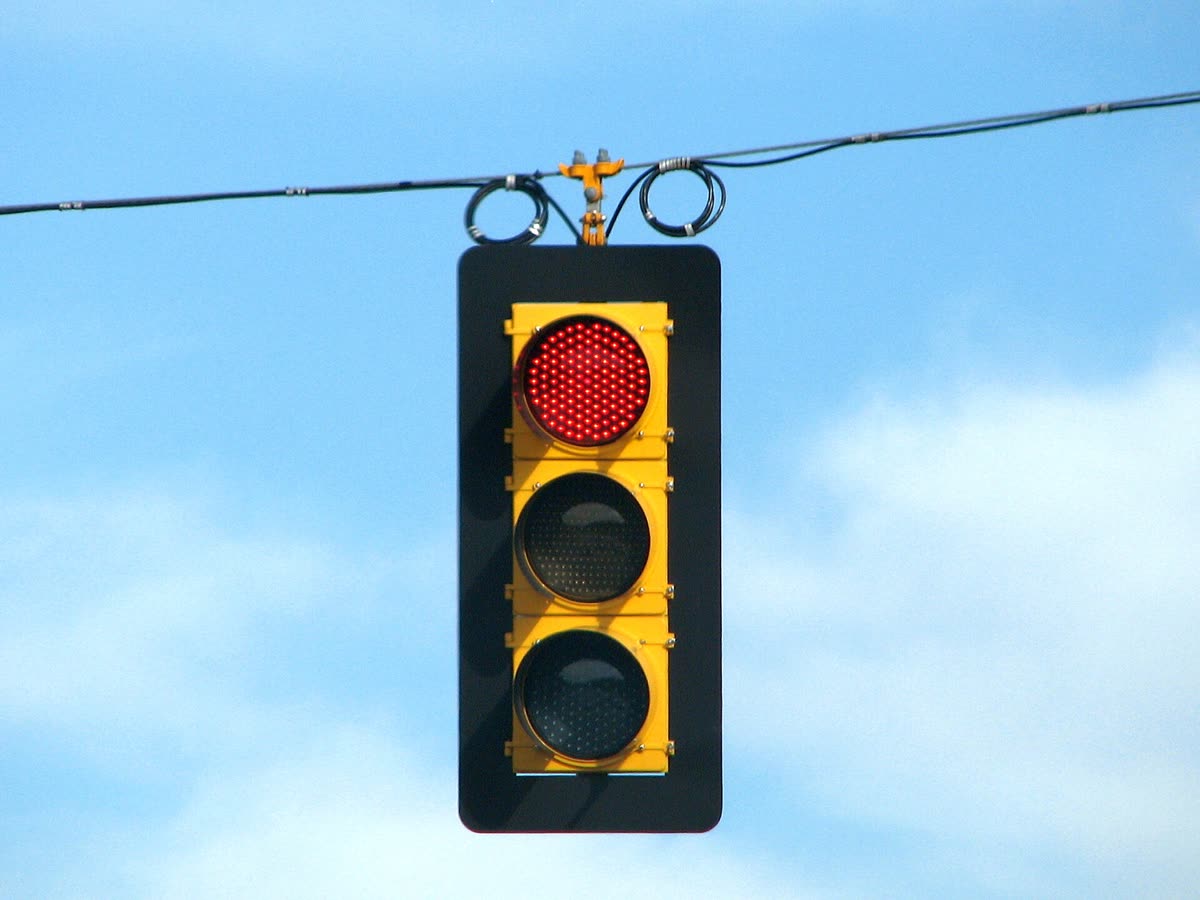
Colour is a signal before it's a style. Red says "problem", one bright button says "start here", a grey label says "less important". Those signals only work if people can see them: on a cheap screen, in sunlight, with tired eyes, or with a colour vision deficiency. Good colour work starts with contrast and meaning, and only then with taste.
What you'll be able to do after reading:
- Explain what a contrast ratio is and check one
- Apply WCAG 2.2's minimums for text, large text and controls
- Never use colour as the only way to show meaning
- Build a small palette where each colour has a role
1. Contrast ratio in one minute
Contrast ratio compares how light two colours are. WCAG measures it on a scale that "can range from 1 to 21 (commonly written 1:1 to 21:1)" (WCAG 2.2): 1:1 is the same colour twice, 21:1 is black on white. You don't calculate it by hand; free checkers such as WebAIM's Contrast Checker do it for you.
Some reference points (on a white background, calculated with the WCAG formula):
| Text colour | Ratio | Body text (4.5:1)? |
|---|---|---|
| #595959 dark grey | 7.0:1 | Yes, even AAA |
| #767676 mid grey | 4.54:1 | Yes, just |
| #949494 light grey | 3.03:1 | No; only large text |
| #CCCCCC pale grey | 1.61:1 | No |
The surprise for many designers: the "elegant" light grey in many mock-ups fails.
2. The WCAG 2.2 minimums
Normal-size text against its background.
WCAG 1.4.3, level AAFrom about 24 px, or about 18.5 px bold.
WCAG 1.4.3, level AAField borders, icons, focus rings, chart lines.
WCAG 1.4.11, level AAA stricter target for normal text.
WCAG 1.4.6, level AAA| Criterion | Level | What it asks |
|---|---|---|
| 1.4.3 Contrast (Minimum) | AA | Text has "a contrast ratio of at least 4.5:1"; large-scale text at least 3:1 |
| 1.4.6 Contrast (Enhanced) | AAA | At least 7:1, and 4.5:1 for large text |
| 1.4.11 Non-text Contrast | AA | Visual information needed to identify user interface components and states, and parts of graphics needed to understand them, at least 3:1 against adjacent colours |
| 1.4.1 Use of Color | A | "Color is not used as the only visual means of conveying information, indicating an action, prompting a response, or distinguishing a visual element" |
Source: WCAG 2.2, W3C Recommendation (first published 5 October 2023, current version 12 December 2024).
Large text in WCAG means at least 18 point, or 14 point bold. W3C's guidance converts that to "approximately 18.5px and 24px" (Understanding 1.4.3). Logos and text in inactive controls have no contrast requirement.
Non-text contrast is the one people forget. It covers the border of a text field, the outline of a checkbox, an icon-only button, a focus ring and the lines in a chart. A pale grey field border on white usually fails it, and people can't see where to type.
Most teams target level AA. Treat it as the floor, not the goal.
3. Never colour alone
About 1 in 12 men has a colour vision deficiency, most often trouble telling red from green (US National Eye Institute, Color Blindness). Add bright sunlight, old screens and printouts, and colour alone fails many more people.

| Colour alone (fails 1.4.1) | Colour plus something else |
|---|---|
| A field turns red when there's an error | Red border and an icon and a message: "Enter a date after today" |
| Links are blue, with no underline, inside body text | Links are underlined, or differ in more than hue (W3C accepts a 3:1 lightness difference from surrounding text) |
| Chart lines in red and green only | Different line styles or direct labels on each line |
| "Required fields are in green" | An asterisk or the word "required" |
NN/g gives the same advice for hierarchy: "Do not rely only on color to communicate visual hierarchy" (NN/g, Visual Hierarchy in UX, 2021).
4. A palette with roles
Instead of picking "nice blues", give each colour a job. Material Design 3 names its colours by role: surface for "backgrounds and large, low-emphasis areas", primary, secondary, tertiary as accents, error, and "on" colours for text and icons placed on top of each one (for example "on primary") (Material Design 3, Color roles).
Large, calm areas behind the content.
Most of the screenThe one thing you most want people to do.
Used sparinglyErrors and destructive actions.
Always with text or an iconThe colour of text and icons on top of each role.
Paired so contrast passesWhy roles help:
- Meaning stays consistent. If error red only ever means "problem", people learn it.
- Contrast is planned in pairs. Each fill colour has its own text colour, checked once.
- Dark mode and rebrands get easier. You change what each role points to, not every screen.
NN/g's rule of thumb fits well: in simple designs, "limit your color use to 2 primary and 2 secondary colors", and "Reserve warm bright colors, like red, for warnings or errors" (NN/g, 2021).
5. Common mistakes
- Light grey text and placeholder text that fails 4.5:1.
- Field borders and icons below 3:1, so controls disappear.
- Errors shown only by turning something red.
- The brand colour used for everything, so it no longer means "act here".
- Checking contrast once on a perfect monitor and never in sunlight or dark mode.
6. Vocabulary
| Term | Meaning |
|---|---|
| Contrast ratio | How different two colours are in lightness, from 1:1 to 21:1 |
| WCAG | Web Content Accessibility Guidelines, from the W3C |
| AA / AAA | WCAG conformance levels; AA is the common target, AAA is stricter |
| Non-text contrast | Contrast of controls, icons, focus indicators and graphics |
| Colour vision deficiency | Reduced ability to tell some colours apart ("colour blindness") |
| Colour role | The job a colour does (surface, primary, error), not its hue |
7. Try it (no tools needed)
- Look at an app you use and find every place where colour carries meaning (errors, status, links, selected tabs).
- For each one, ask: would I still understand it in black and white? Write the ones that fail.
- For each failure, write the extra cue you'd add: text, an icon, position, an underline or a shape.
Optional: paste two colours into a contrast checker and see whether your favourite grey passes 4.5:1.
Reflection questions: Which colour in that app does too many jobs? What would you lose if you removed it from everything except its main role?
8. If you already practise
- Store colours as role tokens ("color-error", "color-on-primary"), not as hex values in components; see Design tokens.
- Check contrast for every state: hover, focus, disabled, selected, and in dark mode.
- Test status colours with a colour-blindness simulator, and read Accessibility fundamentals for the rest of WCAG.
Checklist
Learn more
- W3C: WCAG 2.2 (2023, updated 2024) · Understanding 1.4.3 Contrast (Minimum) · Understanding 1.4.11 Non-text Contrast · Understanding 1.4.1 Use of Color
- Tools: WebAIM Contrast Checker
- Material Design 3: Color roles
- National Eye Institute: Color Blindness
Books, courses and videos to go deeper
- Interaction of ColorJosef AlbersBook · Yale University Press, 1963 · the classic on how colours change each other (Amazon)
- Accessibility FundamentalsW3C WAIfree (external site)
Book links go to Amazon. As an Amazon Associate I earn from qualifying purchases, at no extra cost to you.
Related
Typography for interfaces · Visual hierarchy · Accessibility fundamentals · Design tokens · Interface states: empty, loading, error, success